3D Modeling Lighting: How to Make Mattress Renders Sell
Your best-selling hybrid has a quilted cover with real loft, a multi-layer foam stack you're proud of, and a handle stitched on at an angle. On the product page it reads as a grey slab with a shadow under it. Shoppers scroll past, and some of the ones who do buy send it back because the quilt looked deeper in the photo than it feels on the bed.
The model usually isn't the problem. Geometry is clean, scale is right, and the ticking material is scanned from actual fabric. What's missing is light. 3D modeling lighting is the stage where a technically accurate asset turns into a convincing one, and it's the stage mattress brands most often underfund.
What the render has to carry
Ticking roughness: diffuse light across the cover shows whether the fabric is a matte stretch knit or a satin with directional sheen. Flat light makes both look like vinyl.
Foam softness: a gentle gradient across the pillow top tells a shopper the surface gives a little. A hard edge tells them it's firm before they've read a word of copy.
Stitch depth: raking light puts a readable shadow into every quilt channel so the pattern survives a thumbnail.
Gusset definition: an edge light separates the border tape from the background, which is how the mattress gets a measurable height.
Contact shadow: the dark line where the base meets the floor or frame, so it looks like it sits on something instead of floating.
Skip those and you get a page that renders the shape but not the product. That costs you three ways: conversion on the product page, returns when the delivered quilt is flatter than the photo promised, and consistency across colourways and channels where the same mattress shows up in six slightly different greys.
A mattress render that hides the quilt isn't a style choice. It's a spec sheet with the numbers blurred out.
None of this is a new idea in computer graphics. The Stanford computer-graphics history materials trace the discipline from Turner Whitted's 1980 ray-tracing work, through radiosity in 1984, to James Kajiya's 1986 rendering equation, which formalized how incoming and outgoing light balance at a point. Every highlight on a length of satin piping today sits downstream of that math. If you want to see how much a change in light alone alters a room, the Stahl Home Center guide to build a calmer bedroom setup makes the point with lamps and colour temperature instead of polygons. Fabric works the same way: photorealistic rendering is a lighting decision before it's a materials decision.
Three things decide whether a render sells the mattress: the setup you pick, the order you build the rig in, and whether the colourways stay comparable.
3D Modeling Lighting Setups and What Each One Reveals
Pick the setup before you open the render engine. Each one answers a different question a buyer is already asking, and using the wrong one hides the exact detail that justifies your price.
Setup | What It Reveals | Best Use | Watch For |
|---|---|---|---|
Three-point key, fill and rim | Overall form and product separation | Hero images and product-page lead shots | Flat look when fill is too strong |
Soft top-down directional key | Silhouette and surface softness | Clean silhouettes on white | Hides quilt pattern when too diffuse |
Low raking side light | Quilt relief and stitch depth | Detail shots of tufting and ticking | Bright ticking clips and loses texture |
Rim or edge light | Edge definition, gusset and handle profile | Side views and cutaways | Halo artefacts on thin foam layers |
IES photometric fixture | Real fixture beam shape and falloff | Showroom and bedroom scenes | Needs the manufacturer profile to be accurate |
HDRI environment | Ambient bounce and floor interaction | Lifestyle room scenes | Colour temperature mismatch against the key |
Start with the three-point rig for a hero image. Add a raking light for the detail shot. Those two cover most of a product page.
The pairing matters. Shoot a hybrid with a broad soft key and the pillow top looks plush and inviting, but the quilt pattern flattens into a suggestion of texture. A shopper can't count the channels, can't judge whether the cover is quilted through or just embossed. Add a low raking light from the side to the same model and every stitch line appears, because the channel walls now cast a shadow onto the floor of the quilt.
That single extra light is the difference between a cover that reads as premium and one that reads as printed.
Two common misfires. First, using the raking light alone on a white or cream cover: the highlight side blows out and you lose the weave you were trying to show. Keep the key modest and let the raking light do the relief work. Second, leaning on a rim light in a cutaway to separate the layers, then discovering a bright halo along the top edge of a thin comfort foam. Pull the rim further back or flag it so it grazes rather than strikes.
For room scenes, the choice is between an HDRI environment and a photometric fixture. Use the HDRI when the floor bounce and ambient colour sell the setting, such as a lifestyle bedroom with a rug and a window. Use the IES profile when a specific lamp in the shot has to behave like the lamp a retailer stocks.
How Light Shows Quilt, Ticking and Foam Layer Detail
Lighting a mattress is an information task before it's an aesthetic one. The visual below shows how much of a layered build only becomes legible once light and shadow do the work.
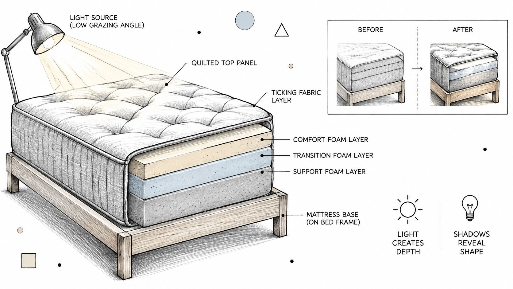
The Routledge extract on the importance of shadows makes the case directly: shadows reveal light direction, contact, depth and surface form, while fill light restores detail in areas that would otherwise be unreadable. It also names the question every bedding brand has to answer: "How much shadow and contrast is needed to show quilting, support zones, edge construction, and layer relationships without making the product appear lumpy, dirty, or inaccurately firm?"
Quilting and pillow-top loft
A low raking light angled across the top panel puts a shadow on one wall of each quilt channel and a highlight on the other. That's what makes loft look like loft. Bring the same light too high and the channels go flat; bring it too low and every channel looks like a crease. Your test is whether a shopper could count the pattern at thumbnail size on a phone.
Ticking and fabric
Diffuse, broad light reveals weave and sheen. It also protects you from hotspots on satin piping and glossier stretch covers, which clip fast and take the texture with them. Matte knits need a bit more directional light to show surface texture at all, because a fully diffuse source makes them look like smooth plastic.
Layers and edges
Cutaways and detail views use controlled fill plus a contact shadow to show the transition from comfort foam to support core, and where the border meets the sidewall. A Digibun style layer breakdown earns its keep here, because the shadow line between two foam densities is often the only cue that they are different materials. If the underlying geometry isn't clean, though, no lighting will rescue it; how mesh density shapes a mattress model covers that side of the pipeline.
The failure mode is contrast that tells the wrong story. Push shadows hard and a smooth cover looks lumpy, a light grey looks dirty, and a plush mattress reads firmer than it sleeps. A shopper who buys on that impression and gets a softer bed has a return reason you handed them.
Practical rule: hero images use soft directional light for comfort and silhouette. Detail views use controlled fill and contact shadows to expose construction.
Before anything publishes, run one check. Could a shopper judge firmness and edge quality from this image alone, without the copy? If the answer is no, the lighting isn't finished.
How to Build a Mattress Lighting Rig Step by Step
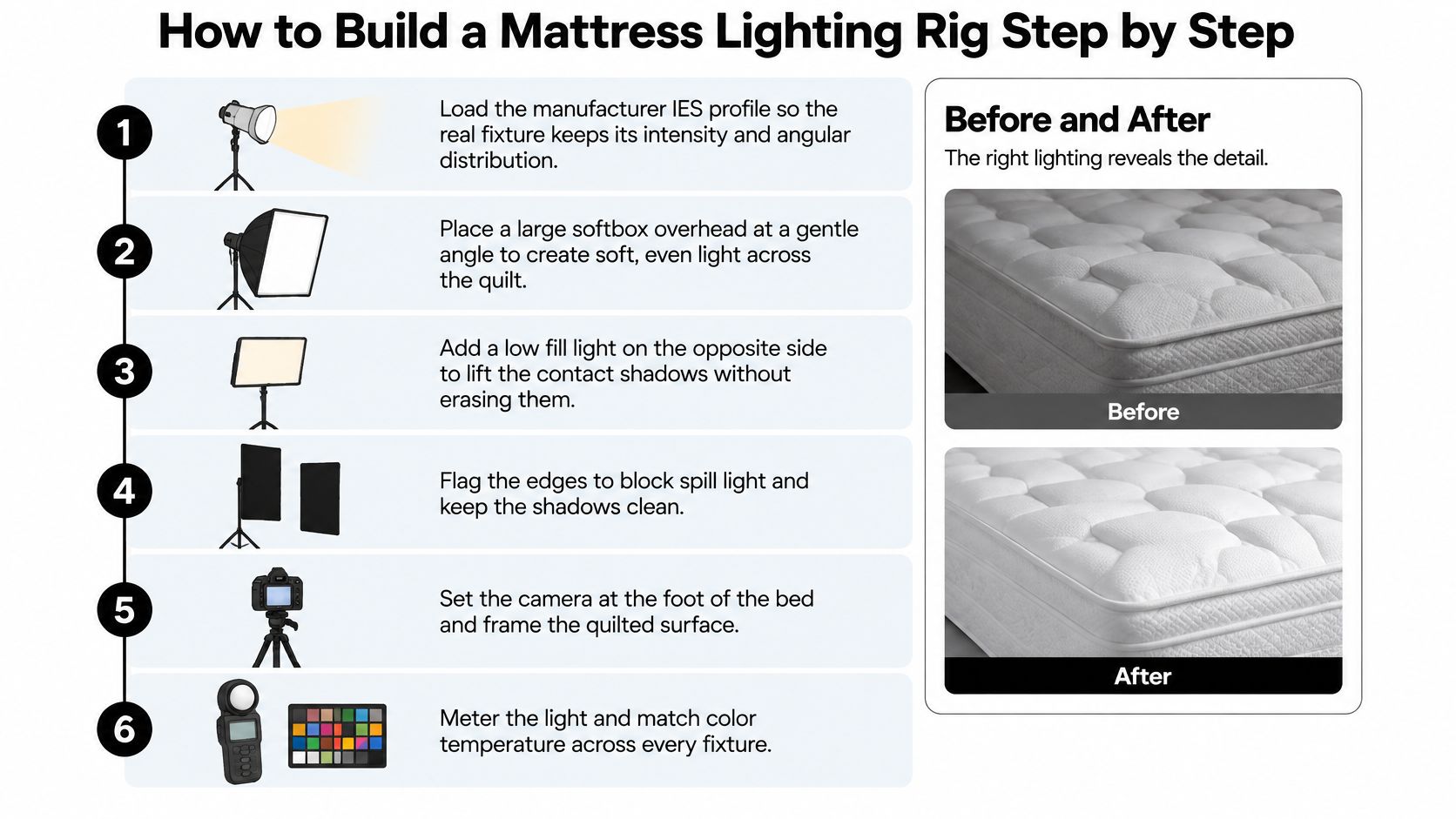
A quilt that looked deep in the viewport goes flat the moment the key sits on the camera axis. Channels lose their shadow, the border melts into the backdrop, and the mattress reads as a slab. Buyers use that slab to judge construction. If the light lies, the return is already in the file. Weak mattress renders usually fail in setup, and fixing them afterward costs more than building the rig in the right order.
Start with the fixture where one exists. Replace arbitrary point and spot lights with measured photometric lighting whenever the physical lamp matters. An IES file stores a luminaire's luminous-intensity distribution as a function of angle, generally in candela, along with the directional pattern the renderer uses, as the IES guide to photometric files explains. Keep the manufacturer's intensity and angular distribution and adjust camera exposure instead of raising power. Cranking wattage to brighten a scene destroys the falloff that made the fixture look authentic.
Place the key light 30 to 45 degrees off the camera axis, high enough to model the quilt. That angle puts a shadow on one side of each channel and a highlight on the other. A key sitting dead-on to the camera flattens the top panel into a single tone, so stitch depth and firmness cues disappear together.
Set fill at about half the key intensity. Fill lifts shadow detail without erasing form. Match it to the key and you get the flat, catalogue-grey look that makes a premium mattress indistinguishable from a budget one.
Add a rim or edge light behind the product. It separates the gusset, border tape and handle from the background, which is what gives the mattress a readable height in a side view. Watch for a bright halo along thin foam edges when the rim is too hot or too close.
Give the mattress something to sit on. A ground plane or plinth creates the contact shadow where the base meets the floor or frame. Without it the product floats and the eye stops trusting the scale.
Set the environment. Use an HDRI for ambient bounce in room scenes, or a neutral studio dome for silhouettes on white. A warm IES profile mixed with a cool HDRI is the most common colour drift in a rig, so match temperatures before you render anything final. That match is the shared baseline. Colourway-specific exposure comes later, on top of this one measured setup.
Render to 32-bit EXR. Bright ticking and satin piping clip easily, and once a highlight is blown in a display-referred file it is gone for good. Linear scene data keeps exposure and tone mapping adjustable later, so one pipeline can still be checked against every colourway.
Check against a neutral grey reference and save the rig as a versioned file. Grey confirms you have not drifted warm or cool between shots. Versioning means you can tell which rig produced the image that shipped, and it keeps the setup reusable inside the wider asset workflow described in how to create 3D renderings.
Noise in a dark corner is a sampling problem. Adding another light to scrub it out is a weak fix. Extra fixtures change the shadow story on the quilt and the border, and they usually add render time without cleaning the noise.
The rig is ready when quilt relief reads at full highlight, the gusset and border are defined against the background, and there is no clipped white or crushed black anywhere in the frame.
Keeping Exposure and Colour Consistent Across Colourways
The instinct is to build one rig and reuse it across the whole catalog. For a mattress line, that instinct is wrong. A cream cover and a charcoal cover lose completely different detail under identical exposure, so enforcing one setup guarantees one of them looks wrong.
What has to be identical is the pipeline. Start by treating lighting as a scene-referred HDR process rather than a final image painted into display range. Research on perceptual accuracy in illuminated 3D environments identifies the lighting model, the tone-mapping operator and the display presentation as the most influential factors in how accurately a scene is perceived. That's the chain to lock down: render linear data to 32-bit EXR, expose the entire product family at one setting, and apply the same tone-mapping and colour-management transform to every output.
Do that and a difference between two images reflects the mattress, not a different highlight roll-off.
The second half is the part that often gets skipped. Guidance on product rendering lighting notes that exposure, material interpretation and colour-management settings vary between render engines, so a rig moved from one engine to another has to be rechecked rather than assumed equivalent. That's true of mattress catalogs that pass between vendors and in-house teams. It's also why a neutral grey check inside each engine beats any amount of eyeballing.
Colourway | Lighting Adjustment | Exposure Target | Risk If Unchanged |
|---|---|---|---|
Light neutrals such as white or cream | Lower key intensity and raise fill | Keep highlights below clipping | Quilt shadows wash out and edges blur |
Mid-tone greys and navies | Standard three-point rig with a grey reference card | Grey card reads neutral in every engine | Colour shifts between render engines |
Charcoal and black | Raise key and add rim light | Lift shadows without a grey haze | Surface detail disappears into black |
Glossy or metallic covers | Softboxes to control reflections | Limit specular peaks | Hotspots hide the fabric texture |
The colour perception problem starts before your render reaches a screen, which is why the same logic in this light bulb advice for new homeowners from Suburban Furniture applies to a cream ticking under a warm fixture: the object didn't change, the light did.
Per-colourway rigs only help if they stay comparable, so validate each one. Shoot calibrated reference photography of the cover under known light, render the same model, and compare. Keep a one-page approved-state sheet per colourway listing the key, fill and rim values, the exposure target and the grey-card reading. Then a navy and a cream version of the same mattress read as the same product on web, on a retail screen and in print.
Lock the exposure, the transform and the colourway rigs in a shared template before the first asset renders. Retrofitting consistency across 40 finished images costs far more than building it once.
A quick note on the last mile. Display conversion is where a carefully matched set of renders splits apart, because one asset gets a different contrast curve on export. How product photography editing affects a catalogue covers that step, and it's worth applying the same discipline to your renders that you apply to your photos.
Confirm Your Lighting Brief Before Ordering Renders
A shopper opens the product page on a phone, reads a soft quilt as a soft bed, and orders a firm mattress. The return starts in the lighting, not in the warehouse.
Pull the five mattress images that get the most traffic. On each one, check whether the quilt relief still reads at thumbnail size, whether the gusset and border edge separate from the background, and whether the cover colour matches the same model in another colourway or on another channel. Mark the failures. That list is the brief. It is also where a page teaches the wrong lesson about quilting, layers or firmness, the kind of misread a buyer only corrects after delivery.
Ordering visuals without that list leaves the rig decisions unspoken. BEDHEAD lists website design and 3D visualization among its services for mattress and bedding brands. Layer views, clean product shots and lifestyle scenes all sit on the same measured pipeline: one shared exposure and colour setup, then a colourway-specific rig checked against it. Put the lighting brief in the same conversation as the asset list, or the new renders will repeat the old misreads.
Shoppers already distrust colour on screen. color guidance from Critelli Furniture covers how to avoid mismatch when ordering online. The gap between a screen and a delivered product is the gap a lighting rig can widen or close.
Before you brief anyone, see Bedhead University. If the audit shows a quilt, a gusset or a cover colour that is not telling the truth, send that list with the order. I would rebuild the assets that change what the buyer believes about construction, and leave the ones that already read correctly at thumbnail size. Start at BEDHEAD.