3D Graphics Images for Mattresses: Creation and Uses
Your best-selling hybrid is on the product page as eleven photographs of the same mattress from slightly different angles, and your largest retail account just asked for a cutaway that shows the coil unit, the transition foam and the quilt stack. The photographer quotes three separate shoots to cover the ticking options, and the new 12-inch profile won't exist as a physical sample until March.
That gap between what a buyer needs to see and what a camera can capture is where 3D graphics images earn their place. Not as decoration, and not as a blanket claim that interactivity lifts conversion. As a way to answer the specific questions a mattress shopper can't resolve from a photo.
What follows is how these images get made, what each format is good for, and where renders still fall short.
What 3D Graphics Images Are for Mattress Products
A 3D graphics image is a computer-generated picture built from a digital model of an object, where shape, material and light come from data rather than from a camera pointed at a sample. For a mattress the model begins as geometry: the box, the border height, the quilt panels, the handles, the gussets that lift a euro-top, and then the foam stack and ticking that give each surface its character.
A photograph is a snapshot of one physical sample on one afternoon. A render is a recipe for the product, and a recipe can be cooked from any angle, in any colourway, at any size, without a sample in the room.
The workload splits the same way. A shoot needs a sample in every ticking you sell, a styled bedroom, a lighting setup and retouching, and a change to foam height or quilt pattern means booking another shoot. A render needs a spec sheet and a model, and swapping a knit ticking for a damask is a material change rather than a new day of studio time.
That standardization is why the field progressed at all. Martin Newell built the Utah Teapot at the University of Utah in 1975, and the Computer History Museum figure cited in the University of Utah's account of the model's history puts its run as a shared benchmark at roughly 20 years. A controlled, recognizable model let researchers compare rendering methods instead of guessing at quality.
The limit deserves a plain statement. A render is only as accurate as the specification behind it, so a wrong layer thickness produces a convincing image of a mattress you don't make.
The test to apply: can this image answer a question the buyer cannot answer from a photo? If not, you're paying for decoration with extra steps.
How 3D Graphics Images Get Their Realism
A shopper comparing two hybrids is trying to tell a performance knit from slick vinyl, and to see whether the quilt sits as high as the sample they pressed in the store. A render answers those questions only when the picture is built in layers. Realism does not arrive in a single pass. A mattress image that looks artificial is almost always missing one of them.
The sequence shown below is the one a studio follows, and each stage locks a layer in place before the next begins.
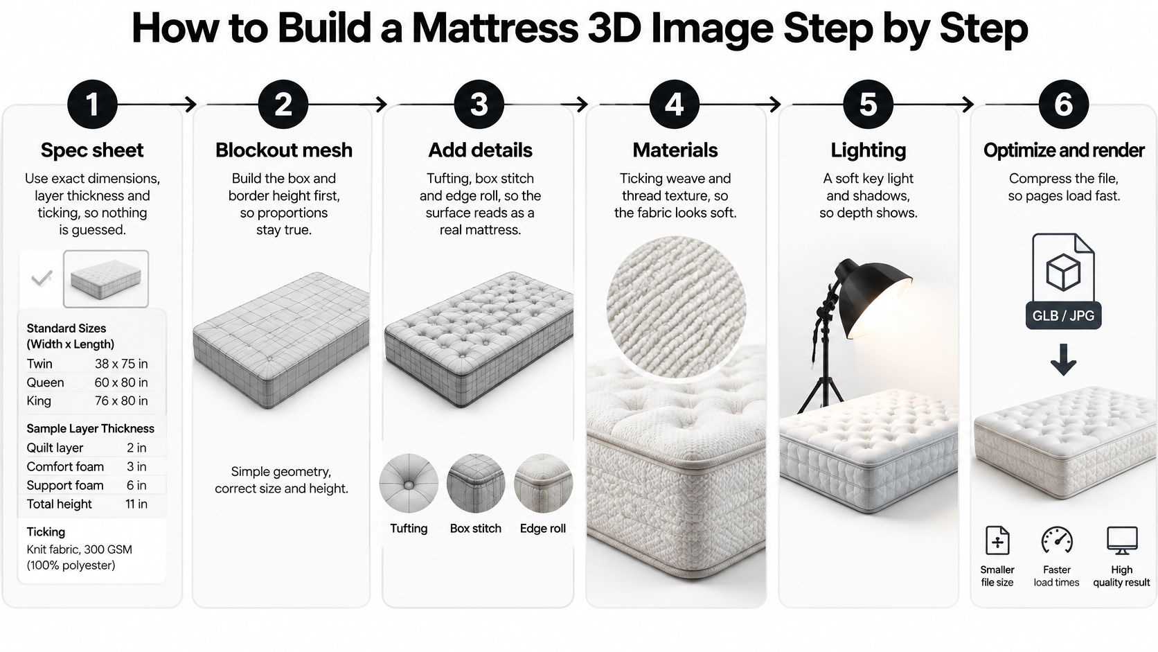
The four layers behind a convincing surface
Geometry is the mesh: the box, the border height, the tufting dimples, the box stitch line, and the curve where the quilt meets the border. Miss the border height by half an inch and an experienced trade buyer spots it instantly. That half inch is how they check the profile against the mattress they already sell.
Shading describes how light travels across soft fabric, so the compression crease at a corner reads as ticking rather than molded plastic. Texture mapping then lays the ticking weave, knit, or stretch cover onto that geometry at the correct scale. Bump mapping adds the small dips around each quilting stitch without piling on polygons. Scale the weave too large and the cover looks printed on, which tells the buyer nothing about the fabric they will touch.
Lighting and reflection decide whether the sheen on a hybrid cover reads as performance knit or cheap vinyl. Get this layer wrong and the image is visual novelty: attractive, and no help in choosing a cover.
The record of 1970s graphics research compiled from Carnegie Mellon's archives traces the first ACM SIGGRAPH conference in 1973, which drew approximately 1,200 attendees. The same period produced Bézier-curve modeling, Phong shading, texture mapping, reflection mapping, and bump mapping. Those techniques turned wireframes into pictures that conveyed curvature, material, depth, and light. The layered structure they established still holds, which is why buyers can judge fabric, stitching, and support layers on a screen.
Geometry can be flawless while the image still fails, because the shading or the texture scale is wrong. Approve each layer against a physical sample rather than approving the composite in one glance, and read what separates a photorealistic render from a merely clean one before you sign off.
How to Build a Mattress 3D Image Step by Step
The workflow below is the one worth holding a studio to, with the reason attached to each step.
Collect the spec sheet. Exact dimensions for the size (Queen 60 x 80 in, King 76 x 80 in, Twin 38 x 75 in), each layer's thickness, the ticking reference and the quilt pattern. Anything left to the modeller's judgment becomes a rebuild later.
Build the base geometry. Box, corner radius and border height come first, because a trade buyer who has sold that mattress for years reads a wrong profile in a second.
Model the layers. Quilt, comfort foam, transition layer and the support core, whether that's pocketed coils in a hybrid or a high-density base, each at its specified thickness. This is what makes the Digibun cutaway possible later without remodelling.
Apply materials. Ticking colour and weave, quilt pattern, foam colour and the edge finish, all sourced from the same reference the factory uses.
Set lighting and camera. A soft studio key light plus a three-quarter angle that shows the edge roll and the top surface in one view, which is how a shopper sees a mattress in a showroom.
Render at the largest size needed first, then at web sizes. Starting big means the same asset serves a sell-in deck, a retail catalog and a product page.
Check the render against a physical sample under store lighting. Colour shifts under showroom LEDs, so approve the render beside the sample rather than on a monitor in a dark room.
Export the variants each placement needs. Ratios, crops and a lighter mobile version, delivered as a set rather than one universal file.
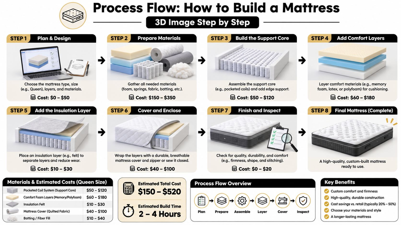
Expectation setting belongs in the same conversation. A render that oversells softness creates a return, so pair the image with plain guidance such as this mattress break-in timeline and setup steps instead of letting a hero shot carry the whole promise.
The two slips that cost the most rework
A gusset height taken from memory. Somebody remembers the euro-top as three inches when the current build is two and a half, and every asset in the campaign inherits the error.
A colour approved under studio light. The render looks right on the studio monitor and grey-green on a retail tablet, and the factory swatch says neither is correct.
Image Formats Mattress Brands Use and Where Each Fits
Adding more formats doesn't improve a product page. The useful question is which format answers the question a shopper is stuck on, at the moment they're stuck on it. Buyers move through those questions in a rough order, from "what does it look like" toward "which one should I choose."
Format | What It Shows | Buyer Question It Answers | Best Placement |
|---|---|---|---|
Silhouette | Clean product on a neutral background | What does this product look like? | Product listing, Google Shopping |
Digibun | Exploded layer breakdown of foam, coils and quilt | What is inside this mattress? | Product page construction section, sales decks |
Room scene | Mattress in a bedroom at true scale | Will it fit my space and style? | Campaign pages, paid social |
360 interactive view | Rotatable model with hotspots | How do the edges and corners look from every side? | Product page, showroom tablet |
Configurator | Swap ticking, quilt and height options | Which combination should I choose? | Online configurator, retail tablet |
The evidence on interactivity is conditional
Academic research from Tilburg University found that interactive product presentations can raise purchase intentions for individual consumers, partly because shoppers perceive an improvement in product quality, but the Tilburg University analysis of when product images influence purchases is careful to say the effect is conditional. Results vary by customer type, product price and platform, and the reported benefit did not apply to business customers. The same analysis found contextual images lifted sales on some sites but not others, with the strongest effects on higher-priced products during busy shopping periods.
That last detail matters for a wholesale audience. If your sales deck goes to buyers rather than consumers, the interactive view may do less work than a crisp Room Scene and a clearly labelled layer diagram, so lead with clarity rather than novelty.
Placement follows the doubt. A 360 view earns its screen space on a high-priced hybrid where shoppers want to inspect the edge, and a Digibun earns it where return reasons keep pointing at construction confusion.
Practical rule: pick the format by the question the buyer cannot answer from text alone, not by which one looks most advanced in a vendor demo.
Once the format is settled, how 3D graphics file formats behave on a page determines whether the asset loads cleanly or stalls the experience.
Where 3D Images Pay Off and What Keeps Them Fast
Returns in this category often trace back to a mismatch between expectation and product. A shopper unsure whether a 14-inch mattress will clear a low headboard, or whether the edge will hold when they sit on it to tie a shoe, is guessing. A Room Scene at true scale settles the size question, and a Digibun placed above the review module settles the construction question at the point doubt begins.
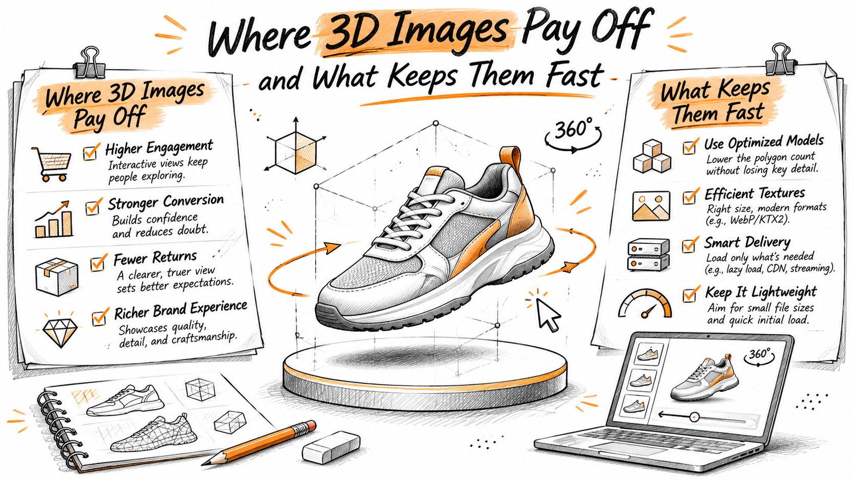
The infographic below shows where each format earns its keep and what keeps an interactive view running at speed.
Channel requirements you can't design around
Google Merchant Center treats the primary product image as a required field. Its Merchant Center image requirements call for an accessible HTTP or HTTPS image URL that accurately represents the product, allow formats including JPEG, WebP, PNG, non-animated GIF, BMP and TIFF, and prohibit promotional text, watermarks and borders in the main image. A clean Silhouette is the safe primary asset for that reason.
For the rest of the page, Google's merchant listing guidance recommends multiple high-resolution images at three aspect ratios, and defines high resolution as at least 50,000 total pixels when width and height are multiplied, served from crawlable, indexable URLs.
Aspect ratio | Minimum resolution |
|---|---|
16:9 | At least 50,000 total pixels (width x height) |
4:3 | At least 50,000 total pixels (width x height) |
1:1 | At least 50,000 total pixels (width x height) |
One coordinated set prepared in advance beats stretching a single hero file into every slot.
What keeps an interactive view fast
On the showroom floor, a tablet showing the layer breakdown shortens the time an associate spends explaining construction, and for wholesale the same model plus a Room Scene belongs in the sell-in deck. A hybrid whose coil and foam stack is the whole story needs the Digibun on the product page and the Silhouette in Google Shopping.
Speed is where interactive formats get judged. A 2023 peer-reviewed Web-AR study published through the PMC article on multi-resolution Web-AR rendering reported a 46% rendering-time speedup against optimized glTF models, GPU load reduced by up to 34%, a 34-million-vertex model displayed in under four seconds, and a stable average of 55 frames per second. Target that frame rate for smooth rotation and zoom, and let fabric and stitching refine progressively after the first usable view appears.
There's headroom in accepting less. A 2025 benchmark of 3D Gaussian Splatting across three hardware platforms, published in the ISPASS 2025 proceedings, found that accepting about a 10% image-quality reduction could produce a 100% frame-rate improvement. Keep close-ups at full detail, then reduce representation during rotation or on mobile hardware, where the same benchmark puts rasterization at 64.76% of total frame time.
Ask your studio for progressive loading, device-specific quality tiers and a frame-rate test on a mid-range phone. That sequence, plus optimizing images for web delivery, is what stops a beautiful model from becoming a slow page.
What 3D Images Cost and Where They Pay Back
Start with what you already spend. A hybrid offered in three ticking colours and two profiles needs three photography setups and two sets of physical samples, and every floor model replaced after wear is another unit that never sells at full margin. One specification plus material swaps covers the same range in renders.
Map each format to the cost it removes or the sale it protects.
Silhouette: cuts photography spend and gives you a compliant primary image for shopping feeds without a new shoot per colourway.
Digibun: reduces the construction questions that land on retail staff and on customer service, and gives the sales deck a page buyers can follow.
Room scene: handles the size and fit doubt that drives returns when a shopper has misjudged scale.
360 view: targets edge and corner questions on higher-priced hybrids, where a small number of avoided returns covers the production cost.
Then measure what moved. Track add-to-cart rate on the product page, return reasons citing fit, firmness or edges, retailer inquiries, and the minutes an associate spends explaining construction. Published conversion figures for 3D and AR shift with category, so set a baseline before launch and compare the same listings afterwards rather than trusting a headline number from a different industry.
Test on your pricier hybrids first, since contextual imagery tends to help most on higher-priced products during busy shopping periods. If you want a sense of the levers that move the number, this breakdown of what drives 3D rendering cost covers where the hours go.
Payback is clear when a format removes a recurring cost or answers a question that was generating returns. Anything else is a line item you'll struggle to defend at budget time.
Common Misconceptions About 3D Mattress Imagery
More interactivity always converts better. A highly detailed model can pull attention away from firmness, dimensions, warranty and return policy. Tie every view to a specification and cut the ones that don't lead anywhere.
A render is a true sample. It shows appearance, not feel. Heights, foam densities and support characteristics still need to live in text and in the showroom, and a render should never stand in for a lie-down test.
One hero image serves every channel. Each placement has its own ratio, crop and level of detail. The shopping feed, the product page and the paid social creative are three different jobs.
A 3D file is a one-time cost. Ticking changes, a height revision or a new coil unit means version control. Without controlled specifications, the render slowly drifts away from the product on the shelf, and nobody notices until a customer does.
It's worth saying plainly that published conversion figures for 3D and AR are category-specific. Treat them as directional, not as mattress benchmarks, and run your own test on your own listings.
The best 3D image is the one that removes a specific buyer doubt. Everything else is set dressing.
Build Your 3D Image Plan Before Briefing a Studio
A merchandiser opens the studio kickoff with last year's hero shot and a request for something more premium. The quilt looks rich. The gusset sinks into shadow. Nobody has written whether the shopper needs to judge fit, the ticking, or what sits under the cover. The files come back attractive, and the same questions stay open on the product page.
Five decisions, written before anyone opens a 3D application, keep the work tied to a buyer question instead of visual novelty.
Name the buyer question for each placement. Put it in plain language, such as "Will a queen clear this frame?" or "What does the ticking look like in daylight?" A view that answers neither is decoration.
Choose formats from the table above. A cutaway fits a construction question. A room scene fits a scale question. Skip a configurator only because a competitor published one.
Audit the spec sheet. Check every layer thickness, overall dimension, and the ticking reference against this season's build, not last year's sample. An old quilt pattern will clash with the mattress on the floor.
Set one aspect ratio per channel. The shopping feed, the product page, and paid placements each need their own crop. Agree those sizes so the studio exports once.
Define how much interaction you need, and how fast it must run. Name the device shoppers use and a performance target before production starts. A heavy model that stutters on a phone answers fewer questions than a still that loads cleanly.
Bedhead Marketing works with mattress and bedding brands on 3D visualization, website design, digital marketing, ecommerce strategy, and creative asset creation, including photorealistic graphics and room scenes. If current imagery still circles the same mattress and never shows the ticking, the quilt, or how the gusset meets the foundation, BEDHEAD can map which formats answer which buyer questions and connect that imagery to the wider channel plan. Contact the team through the website when you are ready to brief a project or a fuller strategy.