8 Styles of Rendering for Mattress Marketing
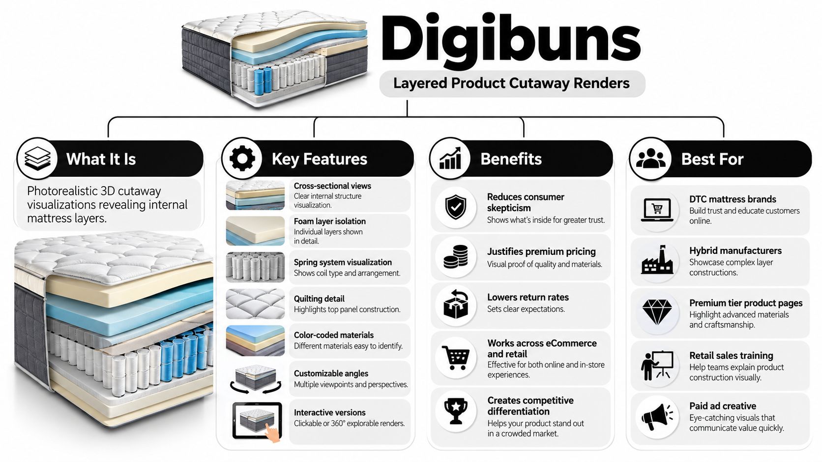
A standard mattress photo can show the ticking, quilt, gusset, profile, and overall finish. It can't show foam densities, spring systems, zoning, or the construction differences between a hybrid mattress and an all-foam model. That gap creates friction in the showroom and on the product page, especially when shoppers are comparing similar prices but can't see why one mattress deserves a higher margin.
The right styles of rendering solve different sales problems. A Digibun explains hidden construction. A silhouette keeps a catalog consistent. A room scene creates lifestyle appeal, while a configurator, comparison render, spin, animation, or AR experience helps shoppers evaluate a purchase in a different way.
Bedhead Marketing works exclusively in the mattress and bedding category, connecting reusable 3D assets with product page optimization, SEO, Google and Meta campaigns, retail education, sales decks, and mattress selling strategy. The same product file can support a manufacturer's dealer presentation, a retailer's showroom tablet, a DTC landing page, and a paid social campaign. That kind of reuse matters more than commissioning an attractive image that has one placement and no further job to do. For a broader look at how visual content can support digital campaigns, compare the approach with AI fashion photography, then bring the decision back to the realities of selling sleep products.
1. Digibuns for layered product cutaway renders
A Digibun is one of the clearest ways to sell a mattress feature that shoppers can't inspect physically. The render opens the product to reveal its foam layers, coils, quilting, ticking, gusset, edge support, or zoning while preserving a polished, photorealistic appearance.
That matters because a photo can't show what's inside a mattress. Cutaway visuals can display layers, zones, coil systems, foam grades, and other internal construction details, helping shoppers understand why a mattress has a particular feel or price point. CGI Furniture explains how mattress renders use cross-sections to make internal construction visible.
A premium DTC brand might use a Digibun beside its flagship product description. A hybrid manufacturer can show the relationship between pocketed coils and comfort foam. A private label retailer can use layered visuals to distinguish a value model from a premium model without relying on vague labels such as “advanced comfort.”
Make the construction easy to believe
The render needs accurate technical input before production begins. Gather the actual foam thicknesses, densities, ILD ratings, spring specifications, quilting details, and material names. If the formulation changes, update the asset. An outdated layer visual can damage trust faster than a missing visual.
Use callouts that translate construction into a shopper benefit:
Cooling layer: Explain what the material is intended to do, without promising a result every sleeper will experience.
Support core: Connect the component to support and stability in plain language.
Quilt and ticking: Show surface materials separately when they contribute to feel, appearance, or durability.
Edge system: Make the perimeter construction visible when usable sleep surface or sitting support matters.
Practical rule: Use a Digibun when the construction difference helps a shopper choose. Don't use one simply because every mattress needs the same dramatic cutaway.
Keep the color system and annotation style consistent across the line. Interactive versions can let shoppers rotate the model, zoom into details, or turn layers on and off. Retail sales associates can also use the same visual on a tablet to explain construction beside a floor model, turning a technical product sheet into a conversation tool.
2. Photorealistic product silhouettes
A silhouette is the dependable workhorse of a mattress visual system. It shows the product in isolation, usually against a neutral background, with controlled lighting, clean edges, subtle shadows, and enough detail to reveal the profile, quilting, ticking, and overall shape.
Retailers need this consistency across product grids. Manufacturers need it in dealer catalogs, spec sheets, line reviews, and product presentations. Private label brands can use the same visual treatment across several firmness options, sizes, and construction tiers without arranging a new photo shoot for every variation.
The strongest silhouette sets usually include a front three-quarter view, a side profile, and a top-down view. The first communicates overall form. The second makes height, gusset construction, and edge design easy to compare. The third gives quilting and surface texture room to work.
Build a reliable catalog foundation
A silhouette shouldn't try to do the entire selling job. It won't communicate the feeling of lying on the mattress, and it shouldn't replace a Digibun when internal construction is the key differentiator. Its role is clarity and consistency.
Use the same:
Camera height: Keep the product family aligned so shoppers can compare profiles without visual distortion.
Light direction: Consistent illumination prevents one model from appearing more premium just because it has stronger highlights.
Shadow treatment: Subtle contact shadows add depth without making the image feel dated or overly dramatic.
Output formats: Prepare versions for desktop product pages, mobile galleries, dealer PDFs, marketplaces, and print use.
An isolated render works particularly well as the first product image, while a room scene or close-up can carry the emotional and tactile parts of the story. On a comparison page, matching silhouettes make differences in height, quilting pattern, and edge construction easier to understand.
This is also where reusable 3D modeling creates operational value. Bedhead's product rendering workflow separates modeling, which establishes the mattress geometry and construction, from rendering, which applies materials, lighting, shadows, and camera angles. Once the product file is accurate, teams can produce alternate ticking, closeups, retailer-specific versions, and room scenes without rebuilding the mattress from scratch, as described in Bedhead's guide to 3D product rendering.
3. Room scenes and lifestyle renders
A mattress is rarely purchased as an isolated rectangle. Shoppers picture it in a bedroom, under their existing bedding, beside their furniture, and within the kind of life they want to lead. Room scenes give the product that context without the scheduling, logistics, and limitations of a traditional photo shoot.
A photorealistic bedroom render can support a homepage hero, a collection page, an email campaign, a social post, or a seasonal landing page. It can also create a consistent visual language for a retailer carrying several brands. The mattress remains the product, but lighting, bedding, furniture, and decor communicate whether the model belongs in a luxury, wellness, family, or value-oriented conversation.
Let the room support the mattress
The most common mistake is letting the bedroom become more memorable than the product. A beautiful headboard, elaborate lighting scheme, or fashionable color palette can attract attention while making the mattress difficult to inspect.
Keep the visual decision clear:
Comfort positioning: Use warm, calm lighting and approachable bedding when the message is relaxation.
Performance positioning: Use cleaner, cooler light when cooling, support technology, or construction precision leads the story.
Audience positioning: A luxury bedroom may fit a premium collection but could feel disconnected from a value-conscious shopper.
Product visibility: Show enough of the mattress profile, quilt, and edge to keep the render commercially useful.
Create several variations from the same bedroom asset rather than treating each image as a separate project. Different camera angles can support product pages and social media. Alternate furniture or bedding can help a retailer test how the same mattress performs across customer segments. Seasonal styling can also be changed without changing the underlying product.
Room scenes work best when the adjacent copy addresses a real sleep concern. A cooling mattress can appear in a bright, breathable setting. A motion-isolating model can be shown in a shared bedroom. A supportive hybrid can sit beside copy that explains its coil and foam construction. The image creates the emotional entry point, while a Digibun, silhouette, or comparison visual provides the evidence.
A room scene should also be connected to the showroom experience. Retail staff can use the image on a display or sales deck to help shoppers visualize the mattress after delivery, especially when the floor model is displayed in a crowded retail environment.
4. Interactive 3D product configurators
A configurator is useful when the mattress has meaningful choices that shoppers need to understand before they buy. The customer may select size, firmness, quilting, fabric, foundation compatibility, or another construction option, then explore the result through a browser-based 3D model.
The value isn't interaction for its own sake. The value is helping a shopper make a decision that would otherwise require a showroom visit or a long product-page explanation. A brand with adjustable comfort options can use a configurator to show how choices change the product. A B2B ordering platform can use it to help retailers specify a private label mattress or place a custom order.
Configurator design needs restraint. If the interface exposes every possible option at once, shoppers can become less confident rather than more confident. Start with the variables that change the buying decision, such as size or firmness, and provide guided presets such as a cooling-oriented option or a choice for shoppers seeking more support.
Interaction must earn its place
Load speed is a commercial issue. A slow model can interrupt the buying journey, particularly on mobile devices. Touch controls should feel natural, the interface should explain what the shopper is seeing, and the page should offer static fallback images when the interactive experience isn't available.
Track what users explore. If almost everyone rotates the mattress but ignores a minor fabric option, that behavior can inform future product-page layout and product development discussions. Pair the experience with live chat, a guided quiz, reviews, or a salesperson handoff so interaction doesn't become a dead end.
A configurator can also help recreate showroom discovery online. The shopper rotates the model, changes a meaningful option, and receives an explanation of the result. That doesn't replace the feel of lying on a mattress, but it can reduce uncertainty around construction and fit.
For a practical look at how these experiences can be planned, see Bedhead's article on 3D product configurators. The same principle applies to interactive video examples from ClipCreator.ai, where the viewer's action has to support the next decision rather than add a decorative layer.
5. Animation and motion graphics renders
Some mattress benefits need time to explain. An exploded animation can separate the quilt, comfort layers, transition foam, coils, and foundation in sequence. A motion graphic can show how a cooling material is positioned, how a support zone runs through the mattress, or how the product is assembled.
Animation is especially effective for product launches, retail training, YouTube education, paid ads, email, and short-form social content. It gives a manufacturer a way to explain new technology before a salesperson has the product in front of a shopper. A retailer can also use a short layer reveal on an in-store screen or tablet to start a conversation with a customer.
One animation needs one sales point
Too many moving parts weaken the explanation. If a video tries to explain cooling, pressure relief, edge support, motion isolation, adjustable bases, and warranty terms in one sequence, the viewer may remember none of them.
A better approach assigns each animation a clear job:
Construction reveal: Separate the mattress into layers and label each component.
Feature explanation: Show one mechanism, such as a coil system or comfort layer.
Lifestyle scenario: Demonstrate how a sleep concern relates to the product.
Retail education: Give sales associates a concise explanation they can repeat accurately.
Use existing Digibuns and silhouettes as the starting point. Animating a proven 3D asset increases its usefulness across channels and reduces the need to create a separate visual identity for every campaign. Bedhead's guidance on product 3D animation follows this asset-led approach.
File size and sound matter. Mobile shoppers may watch without audio, so captions should carry the essential message. Voiceover and music need to sound as considered as the visuals. A product launch video can support a longer explanation, while a paid social placement needs a fast opening and a clear benefit before the viewer scrolls away.
The finished animation should also have multiple aspect ratios. A vertical cut can support short-form social, a square version can fit some ad placements, and a horizontal version can support a product page or sales presentation. Build those variations from the same scene rather than asking the team to start again for every channel.
6. Comparative split-screen and before-after renders
Shoppers often don't need more information. They need a clearer difference between the options in front of them. Comparative renders place two mattresses, firmness levels, or construction approaches beside each other with matching lighting, scale, and camera position.
This format works well for a value-versus-premium range, a foam-versus-hybrid comparison, or a product refresh. A manufacturer can show how a revised design changes the layer structure. A retailer can help a shopper move from a basic model to a higher-margin option by making the added construction visible rather than merely describing it as “upgraded.”
Make comparison fair and quick
Consistency determines whether the visual feels credible. If one mattress is shown from a higher angle or with more flattering light, the comparison becomes a sales trick. Use the same position, crop, background, and shadow treatment for both products.
Limit the message to a small number of meaningful differences. The comparison might focus on:
Construction: Foam-only versus coil-and-foam hybrid.
Feel: Firmer support versus a plusher comfort profile.
Surface design: Different quilt, ticking, or gusset treatments.
Audience fit: A product for a particular sleeping preference or use case.
A firmness gauge, simple scale, or buyer guide can help shoppers connect the image to their own needs. Pair the comparison with questions such as sleeping position, preferred feel, partner disturbance, or temperature preference. The render starts the evaluation, but the surrounding content helps the shopper choose.
Mobile users may respond well to an interactive swipe comparison because it keeps the two products aligned while allowing closer inspection. Static split screens remain useful for catalogs, sales decks, and paid ads where the viewer needs to understand the difference immediately.
Avoid unsupported competitor claims. If a comparison involves another brand, use verifiable product information and keep the language factual. In many cases, comparing your own models is safer and more useful because it helps the retailer guide shoppers through the range without creating a credibility problem.
7. Augmented reality virtual try-on renders
AR places a 3D mattress model into the shopper's own room through a smartphone camera. The experience can help customers judge scale, bed height, proportions, and how a particular design might look with their existing furniture.
This is most useful when visualization affects confidence. A premium mattress, unusual profile, split configuration, or coordinated bedroom collection may benefit from AR more than a straightforward, familiar product. Retailers can also use a tablet-based version in the showroom when a customer wants to see a different size, fabric, or room arrangement.
Treat AR as a decision aid, not a novelty
The first version should be easy to access. Web-based AR can be a practical starting point before a brand commits to a native app. Test the experience on older and lower-powered phones, provide clear instructions, and explain what the shopper should measure or look for. If users don't understand how to position the model, the technology becomes a distraction.
AR should sit beside, not replace, the rest of the product story. A shopper may visualize the mattress in a room and still need to understand its foam layers, warranty, firmness, delivery process, or return policy. Include reviews, testimonials, live chat, and product education close to the AR entry point so questions don't interrupt the journey.
The experience can also support showroom selling. A salesperson might place a different mattress size into a customer's room view, then use a Digibun to explain the construction and a comparison render to discuss the next model. That creates a connected path from visualization to product knowledge.
Use analytics to determine whether people complete the AR experience and whether it contributes to meaningful shopping actions. High usage alone doesn't prove commercial value. The tool needs to help customers select, compare, or inquire about a mattress.
Bedhead's AR product visualization guidance addresses the practical role of this format. For technical inspiration, Grumspot's augmented reality integration examples show how digital visualization can connect a product with the user's own environment.
8. 360-degree product spin renders
A 360-degree spin gives shoppers control over inspection. They can rotate the mattress to review the top surface, side profile, gusset, edge binding, ticking, quilt, and other visible details without opening several static images.
This format is valuable on product detail pages and marketplace listings because it supports the same instinct shoppers have in a showroom. They want to look around the product before they commit. A spin won't show internal construction, so it should sit beside a Digibun or cutaway when hidden features influence the decision.
Give shoppers both movement and detail
Auto-spin can attract attention, but user-controlled rotation is often better for inspection. Offer both where the interface supports it. Let users stop the model, drag it, and zoom into a quilt pattern or edge finish.
Quality and performance need to be balanced. A blurry spin can make the product look less trustworthy than a sharp static image. Large files can also slow the product page, particularly on mobile connections. Optimize the asset, test the startup experience, and keep static thumbnails available so the shopper can move through the gallery quickly.
A useful spin sequence might include:
Top view: Shows quilting, fabric treatment, and surface design.
Side view: Communicates height, profile, and overall proportion.
Corner view: Reveals gusset construction and edge finishing.
Close inspection: Highlights stitching, ticking texture, and binding.
Use spins alongside silhouettes, room scenes, and closeups rather than replacing the entire gallery with one interactive model. The static images help shoppers scan quickly. The spin rewards shoppers who want a deeper inspection.
For implementation considerations, Bedhead's 360-degree spin resource provides a relevant starting point. The objective isn't to add movement to every product page. It's to give the shopper a useful inspection tool where visible construction and finish matter.
Comparison of 8 Rendering Styles
Item | Implementation complexity | Resource requirements | Expected outcomes | Ideal use cases | Key advantages |
|---|---|---|---|---|---|
Digibuns (Layered Product Cutaway Renders) | Mid–premium | Precise product specs, 3D artist time, revisions | Higher conversions, lower returns, clearer specs | PDPs, sales sheets, retail training, ads | Makes internal construction visible and verifiable |
Photorealistic Product Silhouettes | Low–mid | Reusable 3D model, consistent lighting setup | Scalable catalog imagery, fast SKU updates | Product galleries, marketplaces, catalogs | Uniform, professional product presentation |
Room Scenes and Lifestyle Renders | Premium | Creative direction, set/prop modeling, lighting, longer render times | Strong emotional engagement, higher ad performance | Hero banners, social, campaigns, brand storytelling | Communicates lifestyle and aspirational value |
Interactive 3D Product Configurators | Very high | Web dev, backend integration, optimized 3D assets | Increased engagement, improved confidence, data on preferences | Customizable product lines, virtual showrooms, complex SKUs | Real-time customization and immersive exploration |
Animation and Motion Graphics Renders | Mid–premium | Storyboard, animation artists, sound design, longer timelines | Higher ad engagement, better product education | Video ads, product launches, educational content | Explains complex features dynamically and memorably |
Comparative Split-Screen and Before-After Renders | Low–mid | Multiple 3D assets, consistent lighting, labeling | Faster decision-making, supports upsells, reduces friction | Comparison pages, ads, buyer guides | Makes differences explicit for easier choice |
Augmented Reality (AR) Virtual Try‑On Renders | Very high | AR platform/dev, device testing, optimized models | Reduced hesitation, higher perceived value, lower returns | Premium products, in‑store tools, virtual showrooms | Shows product at scale in customer's real space |
360‑Degree Product Spin Renders | Low–mid | High-quality 3D model, optimization for web/mobile | Increased engagement, thorough inspection capability | PDPs, marketplaces, mobile apps | Complete visual inspection with efficient asset reuse |
Match the rendering style to the sales job
The best rendering style isn't the most technically impressive option. It's the one that answers the question blocking the sale.
Use silhouettes when the business needs clean, consistent catalog and product-page imagery. They establish a reliable visual system across models, sizes, firmness choices, and retail listings. Use Digibuns when the shopper needs to understand foam layers, coil systems, zoning, quilting, or another construction feature that a photograph can't reveal.
Choose room scenes when the product needs emotional and lifestyle context. They help DTC brands shape a collection, give retailers a more aspirational homepage visual, and let campaign teams address customer groups such as hot sleepers, couples, or shoppers looking for more support. Keep the bedroom subordinate to the mattress and make the surrounding copy carry a specific sleep benefit.
Use comparison renders when the range is difficult to take in at a glance. A side-by-side view can clarify value tiers, foam and hybrid construction, firmness options, or a product refresh. Use 360-degree spins when shoppers need to inspect visible details such as ticking, edge binding, gussets, quilting, and profile. A spin supports inspection, while a Digibun supports education. They solve different problems.
Choose animation when the product story unfolds over time. Exploded views and layer reveals work well for launches, retail training, product videos, and paid media. Keep each animation focused on one feature. Use configurators when shoppers have meaningful options and need immediate visual feedback, but don't force a complex interface onto a simple mattress.
AR is best reserved for higher-consideration situations where room scale or configuration affects confidence. It can support online shopping and showroom interaction, but it needs clear instructions, strong mobile performance, and nearby product education. It shouldn't be treated as a novelty campaign disconnected from reviews, specifications, live support, and purchase paths.
Start with an audit of the actual gaps:
Product pages: Are shoppers seeing the mattress clearly, understanding the construction, and comparing models without leaving the page?
Showrooms: Can sales associates explain the product accurately beside a floor model?
Retail materials: Do dealer catalogs and sales decks use the same current product information?
Paid media: Does each campaign have a visual matched to its message and audience?
SEO content: Can educational pages use original visuals that explain mattress construction rather than repeating generic stock imagery?
The 3D asset should be planned as a reusable product file, not a one-off image. Accurate modeling can support a Digibun, silhouette, room scene, animation, comparison visual, sales deck, retailer-specific variant, and product-page closeup. That reuse is particularly important as real-time rendering becomes a standard expectation. Grand View Research reports that software accounted for 77.3% of global 3D rendering revenue in 2025, while architectural visualization represented 41.90% of usage and AR and VR workflows were projected to grow at a 28.10% CAGR. Those figures describe the wider rendering market, but the practical lesson for mattress teams is straightforward. Buyers increasingly expect useful, responsive visual information, not just a single polished product photograph.
Architectural visualization has also shown that conceptual and photorealistic rendering were the two most common styles in its 2024 to 2025 industry survey, with both used more widely than dynamic methods such as animation, VR, and AR. The Chaos and Architizer survey reports that conceptual and photorealistic usage had risen from roughly half of respondents in the prior survey to about two-thirds. For mattress marketing, that supports a balanced approach. Build the core product system with silhouettes, cutaways, and room scenes, then add interactive or motion formats where the customer journey justifies them.
More realism isn't always better. A stylized or simplified render can be more effective when the priority is rapid iteration, brand consistency, or adaptation to a small mobile placement. Autodesk's March 2026 updates included AI-powered animation and stylized shading improvements, a sign that expressive and faster workflows are developing alongside photorealism. Fact.MR projects the 3D rendering market to grow from roughly USD 5.01 billion in 2025 to USD 34.83 billion by 2035. That projection reinforces the importance of choosing a production system, not chasing a single visual trend.
For mattress manufacturers, retailers, private label brands, and sleep product startups, the strongest partner understands both the asset and the sale. Bedhead Marketing combines mattress-specific 3D graphics with SEO, paid media, product page optimization, brand development, retail sales training, and product activation. The work is most useful when a Digibun doesn't end on a product page, but also appears in a showroom presentation, retailer training framework, comparison guide, and campaign.
Bedhead University provides additional mattress education at Bedhead University. The right next step is to review the customer journey from search result to product page, from product page to showroom or checkout, and from salesperson explanation to final decision. Identify the question each visual must answer, then commission the formats that close those gaps.
Bedhead Network, or BEDNET, is also available at www.BedheadNetwork.com. It's free for mattress industry professionals and provides marketing insights, news updates, networking, training resources, an industry directory, and business tools for the people who manufacture, sell, market, and support sleep products.
If your mattress imagery doesn't clearly explain construction, support comparison, or create a convincing showroom-to-online experience, BEDHEAD can connect mattress-specific Digibuns, silhouettes, room scenes, interactive assets, SEO, paid media, and sales training into one practical system. Visit BEDHEAD to evaluate your current product visuals and mattress selling framework, then plan reusable assets around the buying decisions your customers need to make.