Email Marketing Design for Mattress Brands
Your next mattress email is nearly ready: a hybrid in a styled bedroom, the holiday price baked into the JPEG, and competing links to shop, learn more, and find a store. It looks polished. But email marketing design has a tougher job than making the bed look good: move a mattress executive, retail buyer, or sleep shopper toward one useful commercial action.
Email Marketing Design Benchmarks for Bedding
Engagement benchmarks that should judge mattress email design
Metric | Figure | Dataset | Design read |
|---|---|---|---|
Delivery or acceptance | 98.7% | International 2024, 11.4 million campaigns, Flexmail international benchmark | Check delivery separately before blaming weak clicks on inbox placement |
Unique open rate | 32.5% | Same international set | Directional only; don't crown a layout on opens |
Click-to-open rate | 7.6%, down 1.2 percentage points | Same international set | Hierarchy after the open is the design job |
Click-through rate | 2.9%, down 0.7 percentage points | Same international set | Primary creative engagement score |
Delivery, open, unique click | 98% delivery, 35.9% open, 2.3% unique click | DMA UK benchmark, 2024; B2C delivery 99.2% | Segment by audience and email type |
Directional open and click | About 34.23% open, 2.66% click; industry CTR often 1% to 5% | Mailchimp, lists of at least 1,000 subscribers | Compare each list to its own baseline |
These aren't mattress-industry targets. They're useful reference points for separating delivery, attention, and action, which are different problems with different fixes.
Acceptance doesn't establish inbox placement, and an open doesn't establish that someone understood the offer. Apple Mail Privacy Protection can automatically register opens, making open rates a directional measure rather than a clean count of human attention, as explained in Statwharf's email marketing statistics review.
Measure the action the email was built to earn
A manufacturer launching a hybrid should care whether a buyer views specifications or requests a line review. A retailer promoting available floor models should care whether recipients check availability or arrange a showroom visit. A strong open rate doesn't answer either question.
Use a campaign scorecard that connects the email to its destination:
Product education: Track specification views and product-sheet downloads.
Retail activation: Track retailer-resource visits and sales-training inquiries.
Consumer consideration: Track product-page engagement and appointment requests.
Commercial intent: Track qualified quotes, partner conversations, and purchases.
Our guide to mattress email marketing benchmarks provides additional context for choosing a useful comparison. Keep the audience and campaign purpose visible beside every metric.
Make the promise specific enough to click
Seasonal relevance needs substance. A bedding campaign about a warmer room, for example, can use Woodstock Furniture & Mattress Outlet's resource on bedding choices for warmer sleep spaces as supporting reading rather than relying on a vague seasonal headline.
The same discipline applies to a mattress launch. Identify the product category, explain the relevant construction, and tell the recipient what to do next.
Practical rule: A room scene or cutaway can earn attention. The benefit, intended buyer, price or constraint, and next step must remain obvious in live text on the first screen.
Build the Mattress Email from Offer to Button
Build the message before commissioning the artwork. Otherwise, the designer ends up deciding which construction detail matters, where the price belongs, and what the buyer should do.
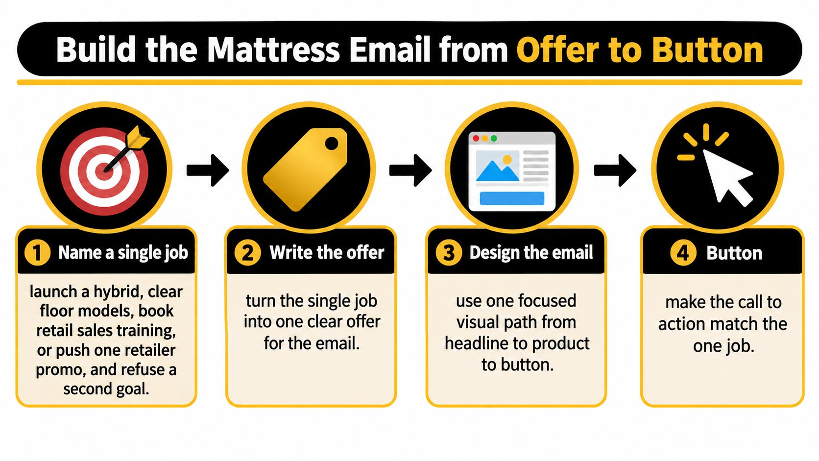
Establish the commercial sequence
Name a single job. Launch a hybrid, clear floor models, book retail sales training, or promote a retailer event. Don't ask the same email to introduce a collection and recruit dealers unless those actions clearly share a destination.
Write the offer without artwork. Include the category, verified differentiator, intended buyer, price or delivery constraint, and action. For a hypothetical side-sleeper campaign, describe the pocketed-coil core, foam stack, quilt-and-ticking top, applicable sleep trial, and actual delivery window before choosing a bedroom scene.
Check the buying question. A retail shopper may need help understanding feel; a merchant may need assortment fit and margin context. Groen's Fine Furniture mattress buying guide is a useful resource to review when checking whether consumer-facing copy answers buying questions rather than merely naming components.
Stack the mobile message. Use a single-column sequence: preheader, recognizable logo, headline, restrained hero, concise explanation, proof block, primary button, optional supporting text link, and footer. Keep the business address, preferences, and unsubscribe controls readable rather than squeezing them into decorative fine print.
Build for the inbox, not a website demo
Use conservative email markup. WooCommerce's email HTML guidance recommends HTML 4.01 or XHTML 1.0 rather than relying on newer HTML5 features, and specifies alt attributes plus explicit width and height for images. Preserve semantic headings inside that conservative structure, and use responsive image styling so the declared dimensions don't force horizontal scrolling.
Make the button an HTML link. Give it strong text-to-background contrast, generous padding, and a label that describes the destination. As a practical starting point, design a touch area around 44 pixels high, then test it on a phone; don't present that working choice as a guarantee of accessibility.
Match the subject line to the first screen. If the subject promises a floor-model opportunity, the opening must identify the model and availability conditions. A generic collection banner creates unnecessary work before the recipient can evaluate the offer.
Keep the first-screen copy short enough that the product and action don't disappear beneath a tall hero. Move detailed construction explanations into supporting modules or the destination page.
With pictures blocked, the opening should still identify the bed, give the recipient a reason to care, and provide a usable next step.
Imagery and Copy That Sell the Bed
Choose the picture for the selling job. Room Scenes establish context for a retail promotion or direct-to-consumer launch; Silhouettes keep product lineups clean; Digibuns, layered inside-product views, explain how foam layers, coils, and ticking fit together.
A cutaway is useful when the construction is the reason to consider the mattress. It isn't a substitute for naming the feel, price, or warranty in readable copy.
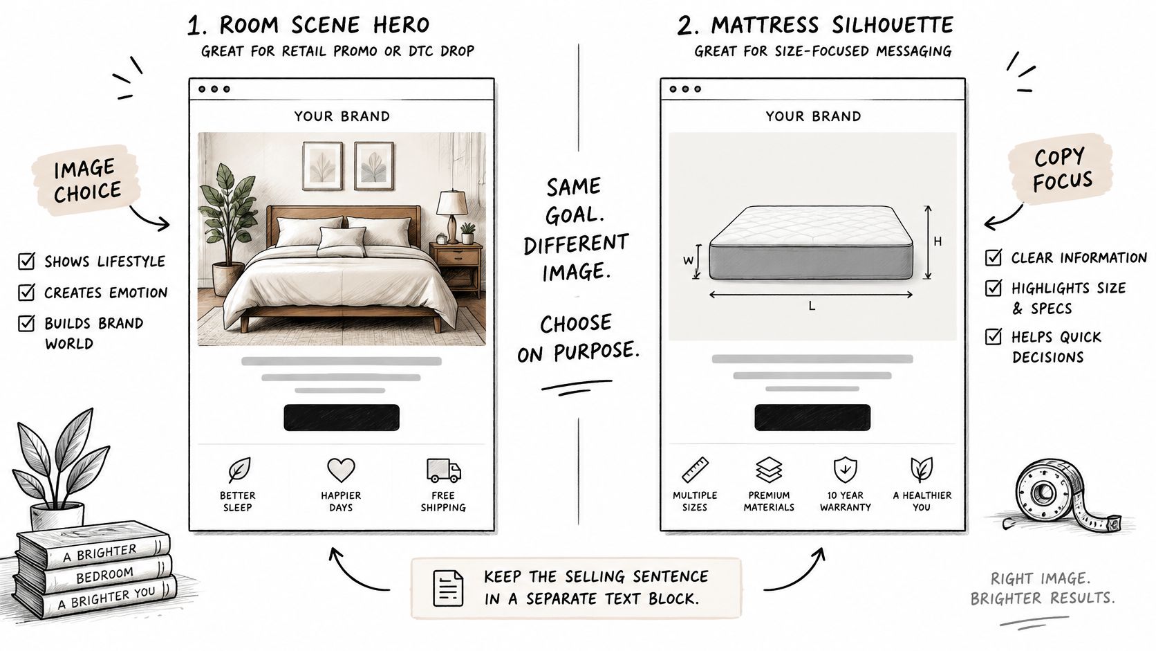
Assign every asset a text treatment
The University of Washington College of Engineering's image-accessibility guidance distinguishes informative imagery from decoration: recreate essential image-based information as live content, and use empty alt text for purely decorative visuals.
Where mattress email content should live
Asset | Treatment | Alt rule | Fails when |
|---|---|---|---|
Room scene hero | Image for attention, offer in HTML | Brief bed-and-room description, or empty if decorative | Price or promotion exists only in the photo |
Digibun or layer cutaway | Image plus live layer list | Name the stack; put detailed foam, coil, and ticking information in HTML | Specifications vanish with images off |
Silhouette or white-background product | Image, size and name in HTML | Product name and size when informative | Size is left to guesswork |
Ticking or color swatch | Image, fabric or color name in text | Name the fabric or color | Options differ only by color |
Comparison of models | HTML table, not a chart screenshot | If an image is unavoidable, repeat every figure in text | A screen reader encounters only a picture of numbers |
Primary CTA | HTML button | Visible label supplies the accessible name | An image button lacks reliable text and focus treatment |
Financing, warranty, or legal line | Live text | Decorative badges get empty alt | Conditions disappear when images block |
Write like someone helping a customer choose
Start with the feel, then explain the relevant build. For a hypothetical model, medium-firm with a cushioned surface communicates more than an unsupported promise of ultimate comfort.
Mention the quilt when its construction helps explain the surface feel. Mention the gusset when it helps identify the model or explain a meaningful design feature. Don't turn every visible detail into a benefit.
Our guide to writing mattress product descriptions can help turn a component list into clearer buying language. Remove any paragraph that could sit unchanged on a dining-table promotion.
Match the button to the buyer
Manufacturers and component suppliers: Use View the layer breakdown or Book a line review.
Retailers and sales associates: Use See floor-model talking points or Book a showroom visit.
Startups and private-label buyers: Use Compare the build or Request specs.
Place the dominant button after the proof block. If a long message needs another placement near the footer, repeat the same action and label rather than introducing another decision.
For a financing or bundle promotion, put the payment explanation and applicable conditions in live text beside the offer or beneath the button. A badge can attract attention, but it shouldn't carry the information someone needs to evaluate the purchase.
Make Rich Product Emails Work Without Pictures
Accessibility failures aren't rare edge cases. Stripo's email accessibility production review reports serious or critical defects in 99.88% of emails examined in 2026, following similarly high rates in 2024 and 2025, and cites an analysis in which 67.01% failed to declare the document language.
Meanwhile, Litmus's State of Email recap reports that only 47% of surveyed companies include even basic accessibility measures such as alt text. Treat accessibility as a production control that protects comprehension and interaction, not an appendix added after creative approval.
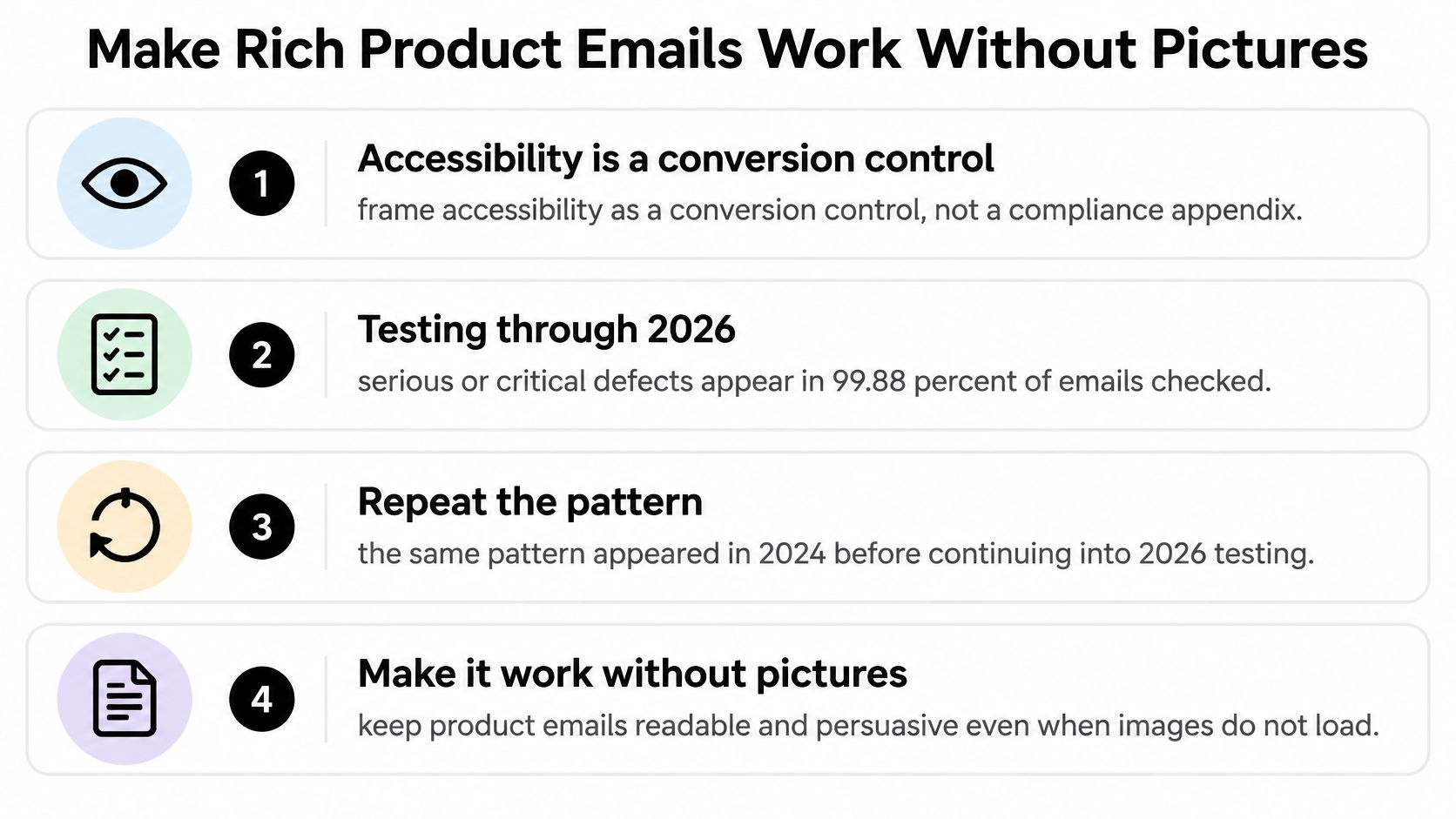
Run the production file through a real QA sequence
Declare the language. Set the document's language attribute. If a retailer campaign includes a second-language module, identify that module's language as well so assistive technology can interpret it appropriately.
Disable images. Read the production email, not the design mockup. Confirm that firmness, materials, price, availability constraints, and the primary action remain understandable without reconstructing the message from filenames.
Listen to the reading order. Use a screen reader such as NVDA or VoiceOver. The sequence should follow the commercial logic: identity, offer, proof, action, and conditions, rather than reading a secondary column before the headline.
Inspect alternatives and modules. Give informative images concise alt text and decorative dividers empty alt attributes. Rebuild dense comparisons, swatch labels, and financing explanations as live modules; mark layout tables as presentational while preserving proper headers for actual data tables.
Check the rendered contrast. Preview light and dark modes in the email clients your audience uses. Inspect reversed logos, pale gray specification text, and buttons whose background may change independently of their label.
Operate it without a mouse. Confirm that links are keyboard-reachable and focus is visible where the client supports it. Test the destination too: an accessible email button doesn't fix a quote form that can't be completed.
Reject decoration that hides the proposition
A cooling-themed gradient isn't a materials explanation. A dramatic layer animation isn't proof of a performance claim. If the benefit can't be expressed in a clear line of live text, ask the product team what the customer is being offered.
Rich media needs a fallback plan, not automatic rejection. Our guidance on using video in email marketing is relevant when a launch depends on motion: provide an understandable static entry point and a descriptive destination link.
Use a send-type pass list before approval:
Product launch: Model, feel, construction, and launch action remain readable.
Retailer promotion: Availability, location, and showroom next step are explicit.
Component claim: Material identity and qualified claim match approved documentation.
Financing offer: Payment explanation and applicable conditions survive image blocking.
Save the approved modules in the master template. Fixing the template prevents the next producer from rebuilding the same defect into another campaign.
A Hybrid Email Rebuilt Before and After
Say a brand drafts a holiday email for a hybrid mattress. The room scene looks inviting, but the price is flattened into the hero, the cutaway has no explanation, and links to the collection, specifications, and store locator carry equal visual weight.
The rebuild doesn't require discarding the imagery. It requires assigning the selling information to the right elements.
Keep the scene, repair the decision path
Before and after rebuild of one hybrid email
Element | Before | After |
|---|---|---|
Offer and price | Baked into the hero JPEG | Live text under the headline |
Calls to action | Three competing links | One HTML button and one supporting text link |
Product detail | Cutaway with no text | Live layer list naming coil, foam, and ticking |
Alt text | Missing on the cutaway | Names the layers in the stack |
Images off | Blank panel and unreadable offer | Headline, price, and button still read |
Place the approved price beneath the headline, followed by the model's actual firmness and verified construction. Include the coil count only when it's confirmed for the advertised size, and name the foam stack without inventing a performance benefit.
The proof block should answer the question the button asks the reader to act on. For a product-page visit, explain what distinguishes this hybrid; for a showroom appointment, explain why it's worth trying against another feel.
Designer handoff: Preserve the room scene, replace image-based selling copy with editable modules, and give the main action clear visual priority.
Adapt the rebuild to a retail floor
A retailer version should identify the floor model, its feel, the applicable offer, and the showroom destination. Keep the specification sheet as a supporting text link for shoppers who want more detail.
The subject line and opening price must agree. The image sets the scene; the message tells someone what they'll find when they arrive.
Test One Design Choice Against Bedding Actions
A full redesign can change the hero, offer, button, and module order at once. Even if performance improves, the team won't know which change mattered or whether it will carry over to another audience.
Set up a test you can interpret
Separate the audiences. Group recipients by lifecycle stage and engagement, then keep manufacturers, retailers, and sales associates in appropriate tracks. A factory buyer evaluating an assortment isn't making the same decision as an associate preparing for a weekend promotion.
Hold the conditions steady. Use comparable randomized groups within the segment and keep send time and destination page consistent. Don't compare a warm dealer list with an inactive consumer list.
Change a defined variable. Test the hero, offer framing, button label, subject line, or module order. Write down the hypothesis before sending, such as whether a labeled cutaway produces more specification visits than a room scene.
Judge commercial engagement. Use unique click-through as the creative signal, then inspect product-page engagement, downloads, inquiries, and qualified-lead or revenue value. Set the evaluation window before launch and avoid declaring a winner from a handful of early clicks.
Mailchimp's email marketing benchmarks provide directional context, not a pass mark for every mattress list. Compare each segment with its own rolling baseline and retain click-to-open as supporting context rather than the final verdict.
Avoid tests that reward the wrong behavior
A curiosity-driven label can generate visits that don't become useful conversations. A specification download, demo request, showroom visit, or partner inquiry is more informative than an unexplained increase in traffic.
Use the same discipline when improving email click-through rates: define the destination action before optimizing the button.
Don't crown opens: Privacy-distorted attention isn't proof of better merchandising.
Don't bundle changes: Changing both the hero and offer prevents a clean interpretation.
Don't flatten buyer roles: A generic factory-and-store message weakens relevance.
Don't stop at the click: Inspect whether the landing page completes the promise.
Treat send day as a separate experiment. The Apsis benchmark report recorded Tuesday and Thursday opens at 19.0%, Wednesday click-through at 2.4%, and Tuesday and Wednesday click-to-open at 10.8%, illustrating why the success metric matters more than copying a supposedly best day.
If AI drafts a variation, a person still verifies materials, certifications, warranty language, regional pricing, and personalization before deployment.
Audit One Campaign Before the Next Send
Pull the next scheduled mattress email and score it against a short working checklist. Use the actual send file, not the presentation deck.
One job: Can the team name the commercial action without adding another goal?
Readable offer: Are the relevant price, firmness, and build available as live text?
Useful button: Does the HTML button describe an action this buyer would take?
Images-off clarity: Can someone understand and act without loading the artwork?
Fix the bottleneck before adding creative
If multiple answers are no, repair those elements before adding another module or discount. Manufacturers should clarify product storytelling when the cutaway does all the explaining; retailers should establish a showroom or floor-model next step when the email is little more than a banner.
A specialist studio can supply layered product views, clean silhouettes, room scenes, and campaign creative that fit this system. The objective isn't a larger asset library. It's a usable connection between the product, the offer, and the destination.
Results still depend on list quality, the offer, and the page after the click. For a broader review of that path, Class A Media's guide can help teams fix email conversion leaks that cost orders.
Keep the learning tied to the category
Bedhead Marketing focuses exclusively on the mattress and bedding industry, serving manufacturers, brick-and-mortar and eCommerce retailers, private-label brands, and sleep-product startups. Continue building category knowledge through Bedhead University.
For ongoing industry context, join the Bedhead Network. It's free for mattress industry professionals, with marketing insights, news updates, networking, training resources, an industry directory, and business tools.
BEDHEAD offers digital marketing, eCommerce strategy, creative asset creation, product storytelling, and high-end visual content for mattress and bedding brands. If your campaign audit shows the offer is trapped in the artwork, visit BEDHEAD to discuss your current product imagery and email creative, and identify what should change before the next send.