Mattress Logo Design That Holds Up Everywhere
Choosing a moon, a cloud, and a calming blue isn't a mattress logo design strategy. Those choices might look comfortable on a showroom sign, then disappear on a sewn label or become indistinguishable from competing brands in a marketplace grid. The first job is recognition, not decoration, including when the printer removes the color and the shopper sees only a thumbnail.
Recognition Before the Salesperson Speaks
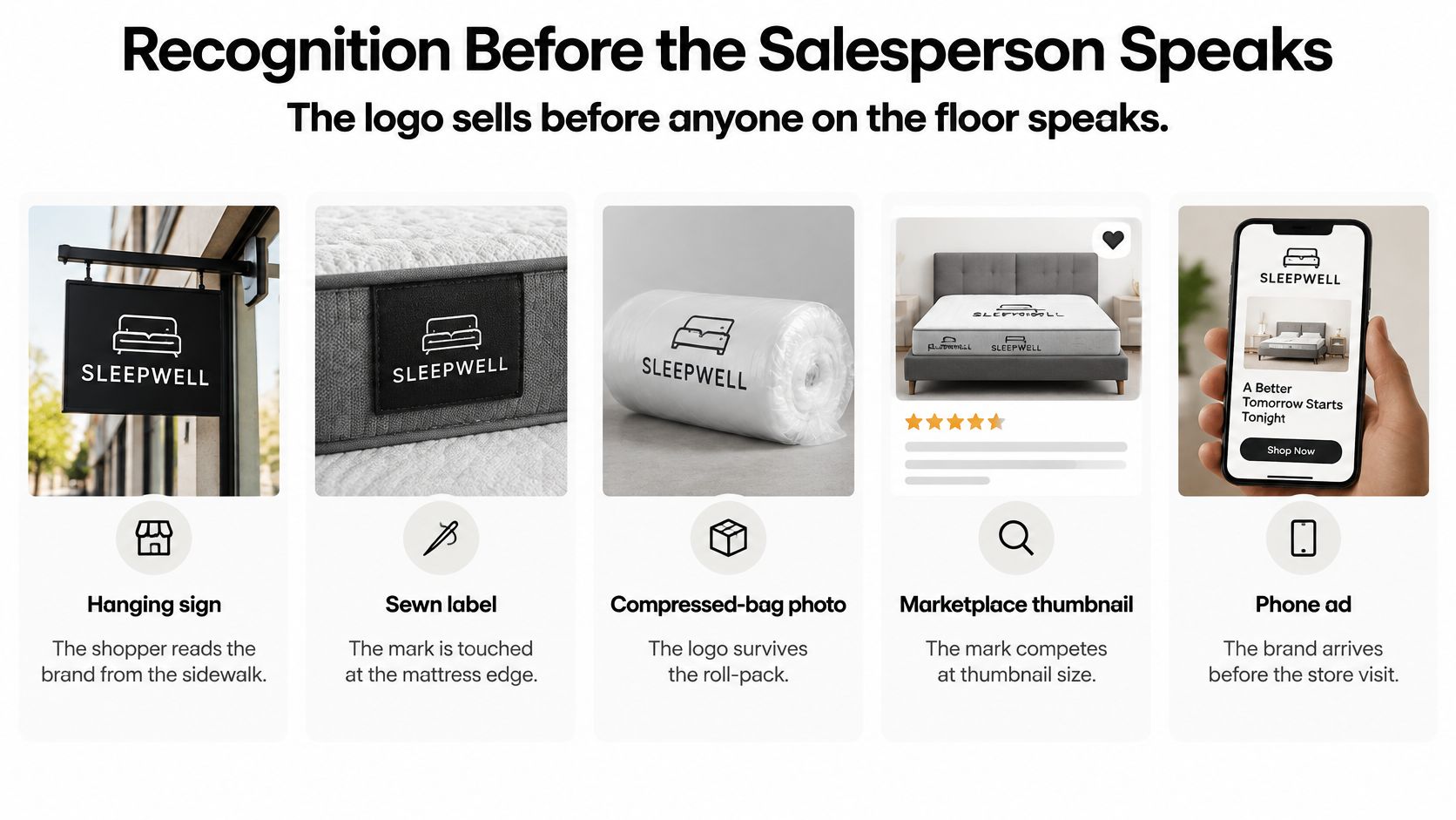
A shopper encounters your hanging sign, touches the sewn label on a floor model, and later searches the brand on a phone. Somewhere between those moments, they might also see a compressed-bag photograph, a marketplace thumbnail, and a paid ad. If those placements look like unrelated companies, your sales associate has extra explaining to do.
A delicate crescent can look elegant above a reception desk and disappear against quilted ticking. A detailed cloud can become an anonymous patch when embroidered. Neither is a successful identity because the presentation mockup looks restful.
Recognition has a commercial purpose
DesignYourWay's logo statistics roundup reports that about 75% of consumers recognize a brand by its logo; it also summarizes a 2019 OnePoll survey of 2,000 U.S. adults, in which 50% were more likely to use a company whose logo they recognized, 74% said overall look and feel could make or break a business, 42% believed a logo communicates personality, 40% said it signals product type, and 39% associated it with quality.
These are broad consumer findings, not mattress conversion forecasts. Their practical value is that recognition and positioning deserve attention before anyone debates whether the blue feels sleepy enough.
For a bedding brand, the positioning question is concrete. Are you selling premium hospitality comfort, wellness-oriented sleep products, an orthopedic collection, family value, or a substantiated sustainability story? Comfort alone doesn't distinguish the offer, because every mattress on the floor makes some version of that promise.
A shopper should recognize the company before they can read the collection name or hear the construction story.
Make repetition deliberate
The same mark has to sit beside national names on a crowded showroom floor and direct-to-consumer brands online. Keep the identifying shape and lettering stable, while adapting the arrangement to the available space.
A useful production reference outside bedding is Custom Sticker Shop's old school Honda logo decal. Examine how a recognizable identity is presented as a discrete applied graphic, then ask whether your own mark can work without its surrounding advertisement.
That distinction matters when building brand consistency across customer touchpoints. Repetition means preserving the recognizable elements, not forcing an oversized showroom composition onto a gusset label.
Approval should therefore cover more than appearance:
Lockup rules: Which arrangement belongs on each surface?
Production checks: What survives reduction, stitching, and single-color printing?
Visual positioning: What makes the brand identifiable rather than merely sleep-related?
Release requirements: Can the plant, retailer, and web team use the files without interpretation?
Touchpoint Sizes and Lockup Rules
Mattress logo lockups by touchpoint
Touchpoint | Minimum size | Version to use | Pass test |
|---|---|---|---|
Showroom sign and endcap | Large, viewed from the aisle | Full-color lockup | Name readable without a salesperson |
Sales deck and hangtag hero | Large to medium | Full-color lockup | Clear beside the collection name |
Product page and paid ad | Small on mobile | Compact lockup | Holds up on light and dark |
Marketplace thumbnail | Smallest live retailer preview | Symbol or compact mark | Distinct next to rival cards |
Mobile header | Narrow bar | Compact lockup | Does not collide with the menu |
Favicon and social avatar | Smallest rendered interface size | Symbol only | Silhouette still identifiable |
Sewn label and law-label area | Smallest approved vendor proof | One-color wordmark | No fill-in at stitch scale |
Embroidery on ticking | Smallest size passing a physical sew-out | Simplified one-color symbol | No hairline strokes |
Carton and compressed bag | Medium, often on kraft or printed film | One-color or reversed | Survives flexo and photography |
Warranty card and invoice | Document scale | One-color wordmark | Clean in grayscale |
The table is an approval sheet, not a drawing specification. Print it, collect the current artwork used in each placement, and mark any row that fails before commissioning a redesign.
The Roundup's mattress industry statistics cite consumer research in which 87% of respondents would consider buying a mattress in a physical store, while 54% would consider buying online in 2023. These are overlapping consideration groups, not separate market shares, and they support keeping both retail and digital applications in scope.
Assign each version a job
A full lockup, the symbol and name in their primary arrangement, belongs where space permits a complete introduction. On an endcap, inspect it from the shopping aisle rather than directly beneath the sign. In a sales deck or hangtag hero, make sure the collection name doesn't appear to be the manufacturer.
A compact lockup rearranges those elements for tighter placements. Use it on mobile product pages and paid ads where the product, price, and offer already compete for attention. Don't solve a narrow header by squeezing the lettering horizontally.
The symbol serves avatars and favicons. It needs a recognizable silhouette without relying on a readable brand name, but it shouldn't replace the name everywhere, especially while a new private label is establishing itself.
The one-color wordmark is the practical workhorse for cartons, invoices, and label applications. Around the law-label area, keep the brand treatment separate from required product information and have the label supplier proof the actual layout.
Test the placement, not an enlarged screenshot
Ecommerce accounted for approximately 23% of the global mattress market in 2024, with an estimated value of US$15 billion, according to the ecommerce mattress market announcement on GlobeNewswire. Thumbnail competition belongs in the normal approval process, not an optional digital review.
Place each version on light and dark backgrounds, textured ticking, and an actual mattress photograph. Inspect the retailer's rendered preview rather than assuming the uploaded image will display at its original size.
For embroidery planning, browse logo size guides for caps from Dirt Cheap Headwear as a useful comparison of constrained stitched placements. Mattress ticking still needs its own sew-out because fabric texture, backing, and stitch direction affect the result.
Give compressed film and cartons equal attention. A sound mattress packaging design process reserves a stable area for the mark instead of placing it across folds, seals, or the most distorted part of the roll-pack.
Symbols Type and Color for Bedding
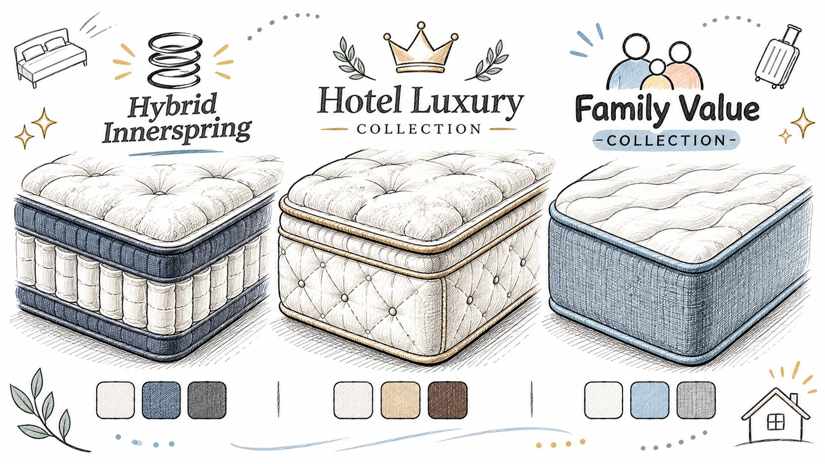
A premium hybrid and a family-value innerspring don't need the same visual language. They do need identities that remain legible beside their collection names, comfort designations, and product specifications.
Start with the product's selling position, then choose the visual route. That's more useful than assembling familiar sleep symbols and hoping the result feels differentiated.
Match the form to the offer
For hybrid mattresses, a simplified construction cue can suggest the relationship between support and cushioning. Don't turn the symbol into a technical cross-section. Foam layers, coil geometry, and quilting patterns belong in explanatory product imagery.
A hotel or luxury collection may suit a restrained wordmark with carefully adjusted spacing. An orthopedic or heavy-use line may benefit from sturdier letterforms, though the logo shouldn't imply medical benefits the product documentation can't support. A family-focused range can feel warmer through rounded forms without becoming childish.
Use brand strategy to define the positioning before choosing those details. Otherwise, every stakeholder is judging personal taste instead of the intended customer and price position.
Build the master in one color, then add a short palette that works on white ticking, charcoal side panels, and kraft cartons. A review of logo color psychology describes color associations as dependent on culture and context, so blue doesn't automatically communicate calm to every buyer. Test the palette on the actual materials rather than borrowing a mood chart.
Sustainability needs adjacent evidence
Consumer findings summarized by Mega Group on mattress sustainability found that 41% of shoppers considered recyclable packaging very important, 39% valued public manufacturer commitments to reduce environmental impact, and 38% valued environmental certifications; the same article describes a trust gap in which nearly seven in ten consumers believed companies had an environmental responsibility, only about three in ten trusted company-provided sustainability information, and nearly eight in ten retailers found mattress sustainability information confusing.
A leaf doesn't resolve that confusion. It can make it worse if the buyer interprets a general brand symbol as a product certification or a promise that the complete mattress is recyclable.
Proof-led identity: Keep the brand signal restrained and put the specific, supportable claim beside it.
Separate certification marks from the master logo. On the product page, carton, and retail display, identify the applicable material or component, the certification and its scope, and relevant disposal or end-of-life instructions. If the evidence applies only to packaging, say packaging.
Consider these directions as starting points, not templates:
Value innerspring private label: A sturdy wordmark with a distinctive letter treatment, supported by clear comfort and size information.
Premium hybrid: A restrained construction-inspired symbol, with detailed engineering explained elsewhere.
Startup with documented recycled packaging: A recognizable master mark accompanied by a precise packaging statement, not an all-purpose environmental badge.
Build the Mark and Catch the Breaks
Treat mattress logo design as a sequence of elimination decisions. An attractive concept stays provisional until someone has tried to break it in the placements that matter.
Develop the identifying form
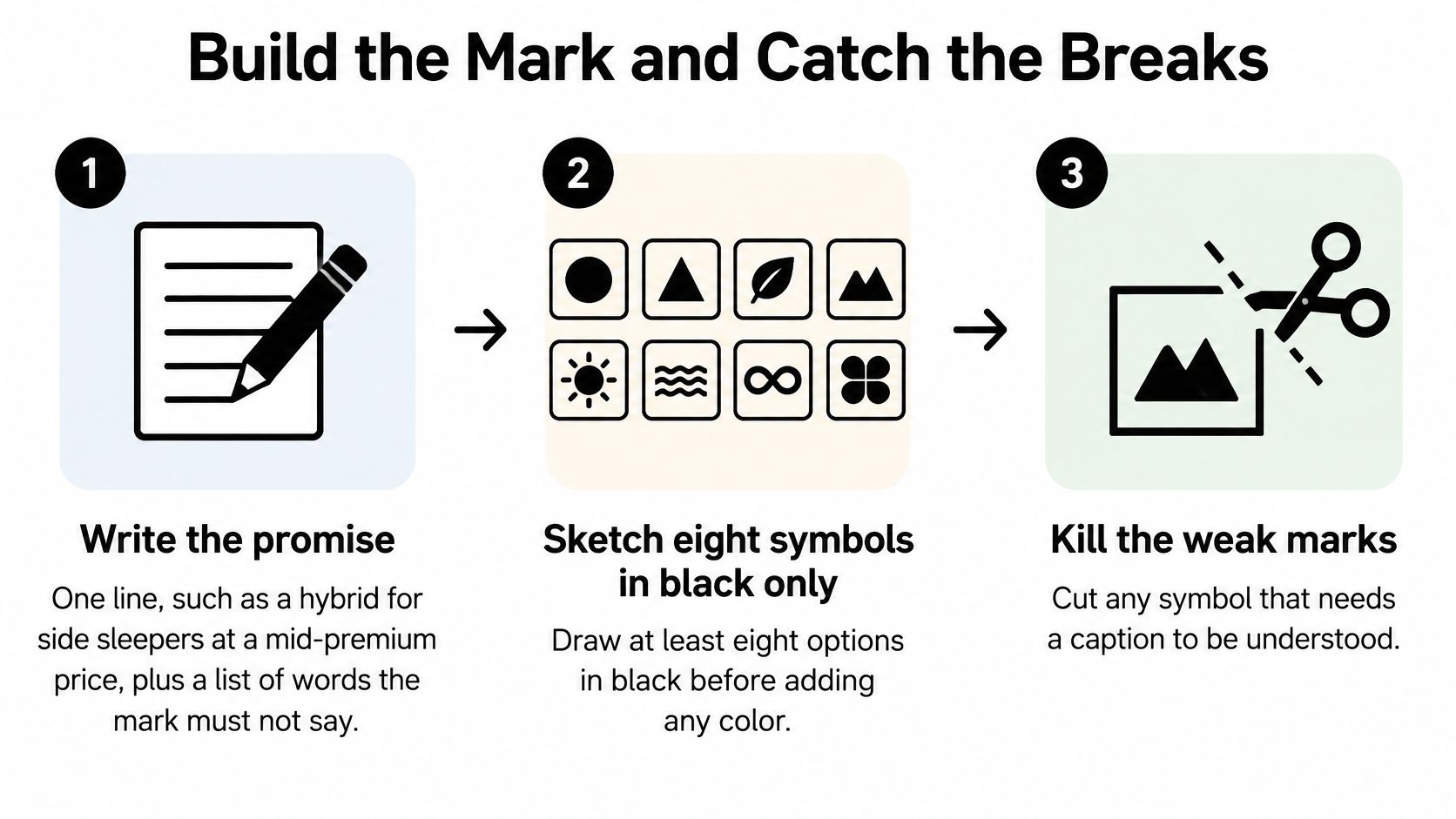
Write the promise before opening Illustrator. A useful hypothetical brief is a hybrid for side sleepers at a mid-premium price. Add words the identity must not suggest, such as bargain, clinical, or children's bedding. These exclusions help the team reject an attractive direction that tells the wrong story.
Sketch at least eight symbols in black only. This is a working exercise, not a claim that a particular number guarantees quality. Remove options that require a gradient, drop shadow, or explanatory caption to make their basic form understandable. A symbol doesn't have to explain the entire mattress, but it needs a reason to belong to this brand.
Shortlist three and compare their silhouettes. Put them beside two competitor marks from the same floor set. Remove names temporarily and inspect the shapes, then restore the names and compare the complete arrangements. If the only distinction is color, the concept needs more work.
Build the vector family. Construct the full lockup, compact arrangement, symbol, and wordmark as related assets. Open the counters, the enclosed spaces inside letters, and adjust spacing against a quilted product photograph rather than a blank artboard alone.
Vector files describe paths rather than a fixed grid of pixels. Keep curves economical and remove accidental points that could complicate production. Don't substitute an automatically traced low-resolution image for properly constructed artwork.
Reduce, compare, and inspect
Use an explicit reduction gate. LogoReview's good-logo guidance recommends testing recognizability at 24 px digitally and approximately 0.5 inches in print, with full-color, one-color, reversed, and grayscale versions checked against different backgrounds. Treat these as practical screening sizes, not universal guarantees that every stitch process or interface will work. Print the small version at actual size. Don't enlarge it to explain why the detail should be visible. If the symbol becomes a blob, remove internal complexity or increase the separation between forms.
Review perception in a fixed order. Start with a brief exposure and ask what name the evaluator read. Then inspect counters and spacing at thumbnail scale, compare color with monochrome, and ask someone outside the project to distinguish the mark from three rivals. Check unaided category association too. If the evaluator assumes the mark belongs to a baby product or a medical clinic, decide whether that association fits the intended bedding position.
LogoReview's evaluation criteria summarize a 2025 study in which 70.48% of respondents supported recognizability as the leading criterion and 90.57% supported minimalist design, alongside text-contrast checks of 4.5:1 for normal text and 3:1 for large text. Use those contrast targets for functional wordmark treatments and nearby interface copy, while recognizing that WCAG exempts logotypes themselves from its minimum text-contrast requirement.
Run protanopia, deuteranopia, and tritanopia simulations, then inspect grayscale, low resolution, glare, and a low-contrast quilt photograph. A color-vision simulator won't reproduce every shopper's experience, but it can expose distinctions that disappear when hues are harder to separate.
Minimalism isn't permission to erase the memorable feature. A perfectly clean crescent can still be indistinguishable from another sleep company's crescent.
Use failures as release conditions
Logo failures on mattress products
Failure | Where it breaks | Fix |
|---|---|---|
Hairline strokes | Favicon and sewn label | Raise stroke weight until the small-screen test holds |
Stitch-like detail inside the symbol | Embroidery and thumbnail | Reduce to a few solid shapes |
Tight letterspacing | Wordmark on quilted photos | Open tracking and counters |
Gradient or shadow only | Carton, invoice, one-color label | Approve a monochrome master first |
Wide lockup with no symbol | Mobile header and avatar | Add compact and symbol versions |
Generic moon or bed outline | Marketplace grid | Redesign until it is distinct from rivals |
Leaf or earth cue without proof | PDP, carton, and retailer training | Keep the cue small and place evidence beside it |
A failed row is a revision request, not a footnote in the presentation. Assign an owner and require a replacement proof in the same placement.
Export for the actual production process. Supply SVG for supported screen applications and outlined vector production artwork for print. Give the embroidery vendor clean source art, then approve the digitized stitch file through a physical sew-out rather than assuming a vector file is machine-ready.
Keep editable masters separate from released production files. Withhold the label artwork, stitch approval, and favicon release until the monochrome reduction checks pass.
Don't ask the logo to explain every foam layer. Give product education its own visual space.
Layer-breakdown imagery, clean product silhouettes, and room scenes can explain construction and help shoppers visualize the mattress. Keeping those jobs separate protects the logo from detail it can't carry and gives the product page room to address fit, expectations, and returns-related questions without crowding the brand mark.
Sign Off the Brief and the Files
Don't order labels, authorize embroidery, or publish replacement assets until the written requirements match the delivered artwork. A concept approval confirms a direction. Production approval confirms that the supplied files work.
The brief should be usable by a manufacturer, retailer, private-label team, or sleep product startup without requiring the designer to interpret it over the phone.
Put approval requirements in writing
Positioning: The selling promise and the associations the identity must avoid.
Audience: Who buys, who specifies, and who sells the mattress.
Competitive boundaries: Marks and category conventions that create confusion.
Required applications: Every relevant placement in the touchpoint checklist.
Restrictions: Banned effects, protected spacing, and permitted backgrounds.
Claims: Environmental wording and symbols that the documentation and legal review can support.
Ownership: Named approvers from marketing, ecommerce, retail operations, and production.
Deliver SVG, PDF, and outlined production artwork, plus a concise usage sheet covering light, dark, and one-color applications. Preserve an editable master separately so future revisions don't start from a flattened export.
For a practical explanation of file problems, Cobra DTF's guide to why print shops reject low-res logos is useful preparation for a vendor handoff. Pair that understanding with brand guidelines that define usage rules, not just a folder of logos.
Budget for decisions as well as drawing
As a planning allowance, think in weeks for a focused wordmark refresh, with more review time for a new symbol and a multichannel rollout. That's not a delivery commitment. Retail, ecommerce, and label-vendor approvals can take longer than the drawing itself.
If the current identity fails a physical label or small-screen check, start with an audit of labels, product detail pages, and showroom signs. A spacing correction or simplified production version may solve the immediate problem without discarding established recognition or consuming margin through unnecessary reprints.
BEDHEAD is a digital marketing agency, design studio, and consultation and training organization focused exclusively on mattresses and bedding. Our work includes brand development, website design, 3D visualization, performance marketing, and sales training, connecting identity decisions with product storytelling and retail activation. For deeper category education, visit Bedhead University; marketing outcomes vary, and specific results aren't guaranteed.
BEDHEAD helps mattress manufacturers, retailers, private-label brands, and sleep startups connect brand development with the product visuals and selling environments shoppers encounter. Visit BEDHEAD to discuss an audit of your logo across labels, product pages, and showroom signs before commissioning replacement artwork. Join Bedhead Network at www.BedheadNetwork.com, a free hub for mattress industry professionals offering marketing insights, news updates, networking, training resources, an industry directory, and business tools.