Basics of Web Design for Mattress Brands
Most advice about the basics of web design starts with a familiar idea: make the site more visual. For mattress brands, that advice is incomplete. A page packed with glossy room scenes, animated 3D layers, video, and oversized lifestyle photography can look premium while making a mobile shopper wait, scroll, or abandon the comparison before they understand the product.
Mattress web design is better treated as performance art direction. Every image, interaction, and layout decision should earn its bandwidth by reducing uncertainty. Can the shopper see the ticking clearly? Can they understand the quilt, gusset, foam layers, support system, dimensions, firmness, warranty, delivery terms, and value without needing a salesperson beside them? The strongest digital showroom answers those questions quickly, then makes the next action obvious.
The World Wide Web was built as an interconnected information-sharing system, not primarily as a visual design platform. CERN's short history of the Web describes how Tim Berners-Lee created the Web at CERN in 1989, built the first server and browser by the end of 1990, and helped make the technology publicly available on a royalty-free basis in 1993. That origin still matters for mattress brands. Good design organizes information, links related details, and helps people understand a complicated product across devices.
Rethinking Visuals for the Modern Sleep Shopper
The popular rule that “more visual” means “better designed” fails on mattress product pages. A shopper needs imagery, but not every image deserves equal priority. A high-resolution close-up of a quilt pattern may communicate craftsmanship, while an enormous decorative background may consume bandwidth without explaining why one hybrid mattress differs from another.
That distinction changes the role of the designer. Instead of shrinking every asset until it looks mediocre, the team should decide which visual answers a buying question. A cutaway showing foam layers can clarify construction. A room scene can establish scale and bedroom context. A clean silhouette can help a retailer compare models in a product grid. A looping video may be useful for demonstrating compression or edge support, but it rarely belongs above every other element on the first load.
Practical rule: Preserve detail where it reduces product uncertainty. Remove decoration that only fills space.
For mattress manufacturers and retailers, the tension is familiar. Product photography needs to show ticking texture, quilting, handles, borders, gussets, and construction. eCommerce pages also need to load reliably for shoppers comparing products on phones, sometimes from a showroom floor or a slower mobile connection. The answer isn't to choose between visual quality and performance. It's to assign each asset a job.
A useful asset hierarchy looks like this:
Hero image: Show the product clearly, with enough context to establish its identity and intended use.
Silhouette: Give shoppers a clean view for comparison cards, retailer listings, and specification areas.
Layered visual: Explain construction, including foam layers, coils, comfort materials, or a specialized support system.
Room scene: Demonstrate scale, styling, and how the mattress fits the bedroom environment.
Video or interactive 3D: Reserve richer media for shoppers who are actively investigating a product difference.
Bedhead's practical guide to using imagery is useful when a team needs to connect asset choice with message clarity. The same principle applies to paid media and SEO. A beautiful image that doesn't explain the product, support a search intent, or help a shopper decide is expensive decoration.
The commercial trade-off is especially sharp for premium beds. A retailer may need room scenes to support the showroom experience online, while a private label brand may need layered graphics to explain a new construction without revealing proprietary manufacturing details. Performance art direction gives both teams a way to prioritize. Keep the first view focused, make the comparison information scannable, and place deeper visual storytelling where high-intent shoppers will use it.
Building Responsive Layouts for Every Screen Size
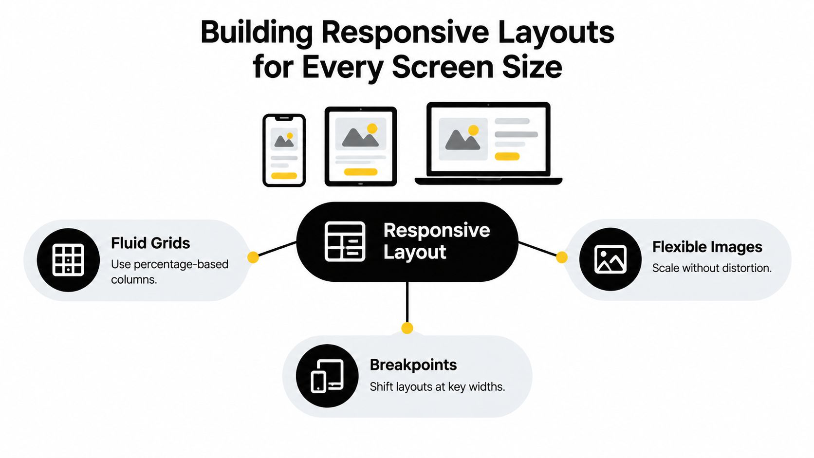
Responsive web design isn't a separate mobile version of a mattress website. It's one flexible system that preserves the shopping task as the available space changes. Ethan Marcotte coined the term in 2010 around fluid grids, flexible images, and CSS media queries, an approach that replaced the assumption that a designer should build a fixed page for every screen size. The history and principles are outlined in this overview of responsive web design.
A mattress page should adapt around its content, not around a list of popular devices. A comparison table may remain comfortable on a wide desktop screen but become unreadable when columns compress. A layered product image may work beside specifications on a tablet, then need to move above the copy on a phone. The breakpoint belongs where the information stops working.
Start with the page structure
Use a fluid grid so columns can expand and contract instead of forcing a fixed desktop width onto a narrow screen. Product cards should retain enough room for the model name, price, firmness description, and primary action. Specification blocks should reflow into a readable sequence rather than compressing into tiny labels.
Flexible images need to scale within their containers without distortion. A product silhouette that overflows its card can push pricing below the fold. A room scene that crops the mattress out of view can communicate the wrong product. Set image behavior around the asset's purpose, then check the result at narrow widths.
The viewport meta tag is a small implementation detail with a major consequence. MDN explains that tells mobile browsers to use the device's actual width instead of treating the page like a roughly 980-pixel desktop layout. Without it, a carefully planned responsive interface may merely shrink the desktop experience.
Choose breakpoints where the content fails
Don't copy a breakpoint because a device list says it's common. MDN's guide to media queries explains how conditional CSS rules can respond to viewport values, orientation, resolution, and user preferences. Test the mattress page and note the first point where:
Navigation: The main menu becomes crowded or difficult to operate.
Comparison: Dimension, firmness, warranty, or material columns lose their reading order.
Imagery: A cutaway becomes too small to interpret.
Forms: Delivery, financing, or retailer inquiry fields become awkward to complete.
Calls to action: The purchase or store-locator action gets separated from the relevant product information.
A practical responsive design resource for small business can help teams review the broader implementation pattern, but mattress brands still need category-specific testing. A phone shopper comparing a queen hybrid mattress with a latex model isn't evaluating abstract responsiveness. They're trying to decide whether the construction, size, comfort, and price justify a next step.
That's why responsive design for mattress websites should be judged by task completion. If a shopper can read the specifications, inspect the layers, select a size, understand delivery, and reach checkout without pinching, hunting, or losing context, the layout is doing its job.
Treating Page Speed as a Merchandising Requirement
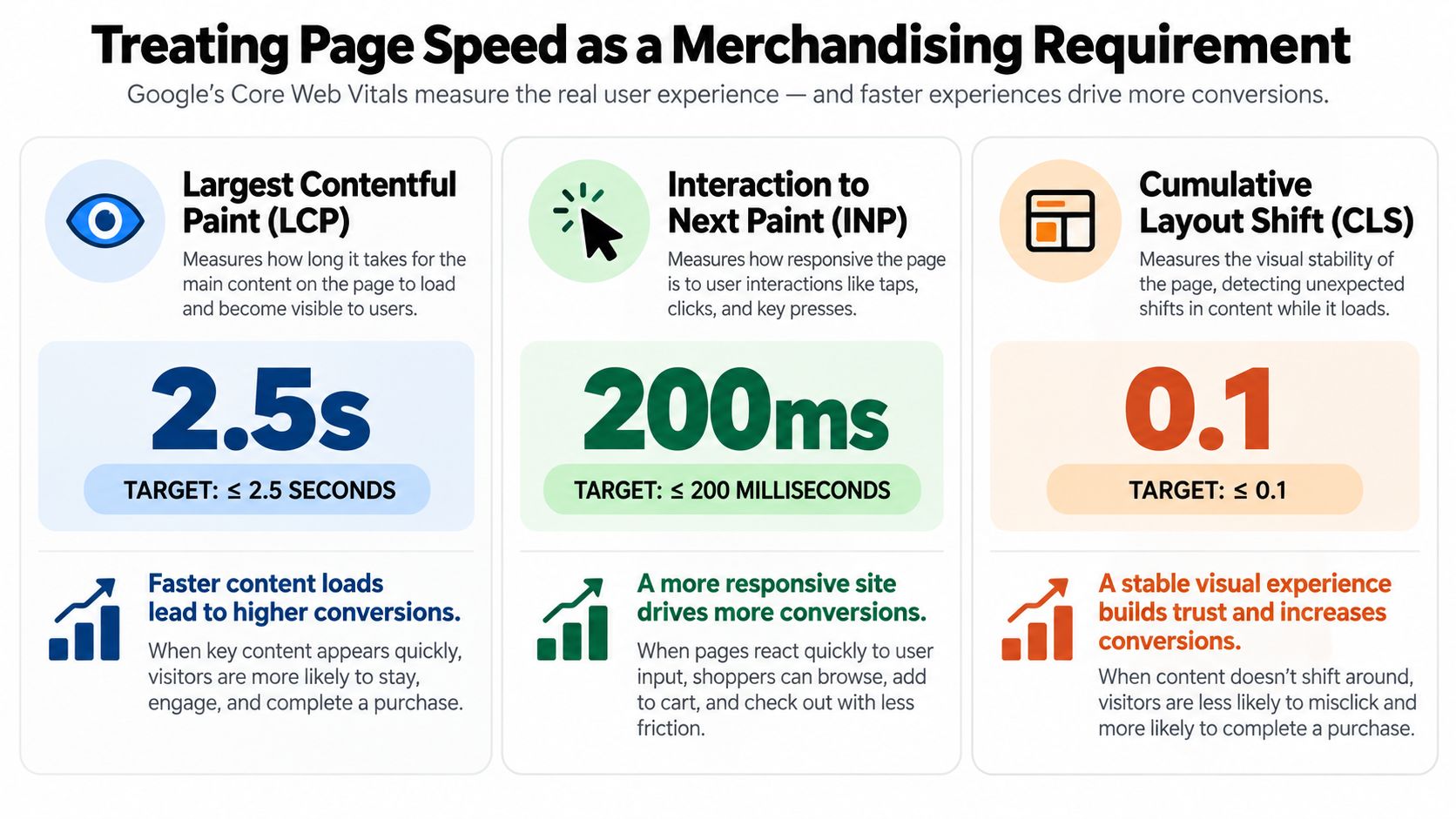
Page speed belongs in the merchandising conversation because slow or unstable presentation can hide the product. Google's Core Web Vitals turn that experience into three measurable dimensions:
Largest Contentful Paint, or LCP: How quickly the primary content becomes visible.
Interaction to Next Paint, or INP: How quickly the page responds after a click, tap, or keyboard action.
Cumulative Layout Shift, or CLS: How much page content moves unexpectedly while loading.
For a page or origin to pass the Core Web Vitals assessment, the 75th percentile must reach the “Good” threshold for all three metrics. That means LCP at or below 2.5 seconds, INP at or below 200 milliseconds, and CLS at or below 0.1, as defined in Google's Core Web Vitals documentation.
Translate the metrics into product-page decisions
LCP is often controlled by the largest above-the-fold asset. On a mattress page, that may be a hero render, a lifestyle room scene, or a product gallery. Prioritize the asset that proves what the shopper is viewing, compress it appropriately, serve responsive dimensions, and avoid loading competing media with the same priority.
CLS is a merchandising problem when the price, firmness selector, or add-to-cart control moves as imagery arrives. Reserve explicit dimensions for product images, video, and 3D containers. A stable image frame keeps the shopper oriented and prevents a late-loading room scene from pushing the product details away from the tap target.
INP exposes interaction friction. Heavy JavaScript, unnecessary third-party scripts, oversized configurators, and slow filter controls can make a product comparison feel broken. A shopper selecting mattress size or opening a construction diagram should receive a prompt response, not a stalled interface.
The merchandising test: If the shopper's view shifts before they can understand the product, the page has failed before the copy gets a chance to sell.
HTTP Archive data reported by Core Web Vitals shows that only 48% of mobile websites passed all three Core Web Vitals in 2025, compared with 56% on desktop, and only 62% of sites met the “good” LCP threshold of 2.5 seconds on mobile. The same source, Core Web Vitals data and improved content, supports a useful contrarian conclusion: visual richness isn't automatically better design, and desktop testing can conceal mobile friction.
Test with real-user data as well as laboratory tools. The 75th-percentile requirement means a fast developer computer isn't enough. Review representative mobile and desktop experiences, then connect the findings to merchandising priorities.
A focused page-load-speed improvement process should ask which asset earns its place above the fold, which media can load later, and which script is delaying a useful interaction. For a mattress brand, the goal isn't a sterile page with no imagery. It's a fast, stable digital showroom that spends bandwidth on the images that help shoppers choose.
Designing Accessible Product Pages That Convert
Accessibility improves the way a mattress page explains itself. A shopper using a screen reader, keyboard, magnification, captions, or reduced-motion settings still needs access to the same product facts as every other visitor. That includes firmness, dimensions, materials, support layers, certifications, warranties, delivery terms, and the action to buy or request help.
WCAG 2.2 requires functionality to be available through a keyboard and includes criteria for keyboard access and avoiding keyboard traps. Visual design also needs sufficient contrast, including 4.5:1 for normal text, 3:1 for large text, and 3:1 for essential non-text interface elements, according to the W3C WCAG 2.2 understanding guidelines.
Build equivalent product information
Alt text shouldn't merely identify an object. It should communicate the image's function. “Cutaway mattress showing memory-foam comfort layer above pocketed coils” helps a shopper understand the construction. “Mattress image” doesn't.
For a product page, check that:
Controls: Native buttons and links work with a keyboard and show a visible focus state.
Selectors: Firmness, size, fabric, and availability aren't communicated through color alone.
Forms: Labels are associated with inputs, errors are clear, and shoppers can recover without losing entered information.
Comparisons: Tables preserve logical reading order when content reflows or text is enlarged.
Media: Product demonstrations include captions, transcripts, or equivalent written instructions where needed.
W3C's technique for meaningful image alternatives explains that meaningful images inserted with an HTML element need concise alternative text. If an image contains essential words, those words belong in the alternative. A purely decorative background can use an empty alt attribute so assistive technology ignores it.
Make checkout part of the design
A product page can be accessible while the checkout creates a barrier. Test the complete path from product selection through delivery information, payment, and confirmation. A useful external reference on how to fix keyboard-navigable checkout pages reinforces the point that accessibility belongs to the transaction, not only the catalog.
The business benefit is clarity. When a team must describe a support layer without relying on a diagram, it often discovers that the original product claim was vague. When a comparison tool works without a mouse, its information architecture is usually easier for every shopper to follow.
Use product detail page optimization for mattress brands as an opportunity to align accessibility, merchandising, and conversion. A clear page doesn't dilute persuasive design. It removes the ambiguity that makes a shopper hesitate.
Strategic Art Direction for Hero and Product Imagery
A hero image should answer the first question, not display every asset the brand owns. For a mattress manufacturer, that usually means showing the product clearly and establishing the reason to continue. A room scene can communicate scale and lifestyle, but it shouldn't obscure the mattress. A close-up can show ticking and quilting, but it shouldn't replace a view that helps shoppers recognize the overall silhouette.
The strongest product pages assign visual assets to different moments of intent:
Early consideration: Use a clean silhouette or clear product view so shoppers can identify the model.
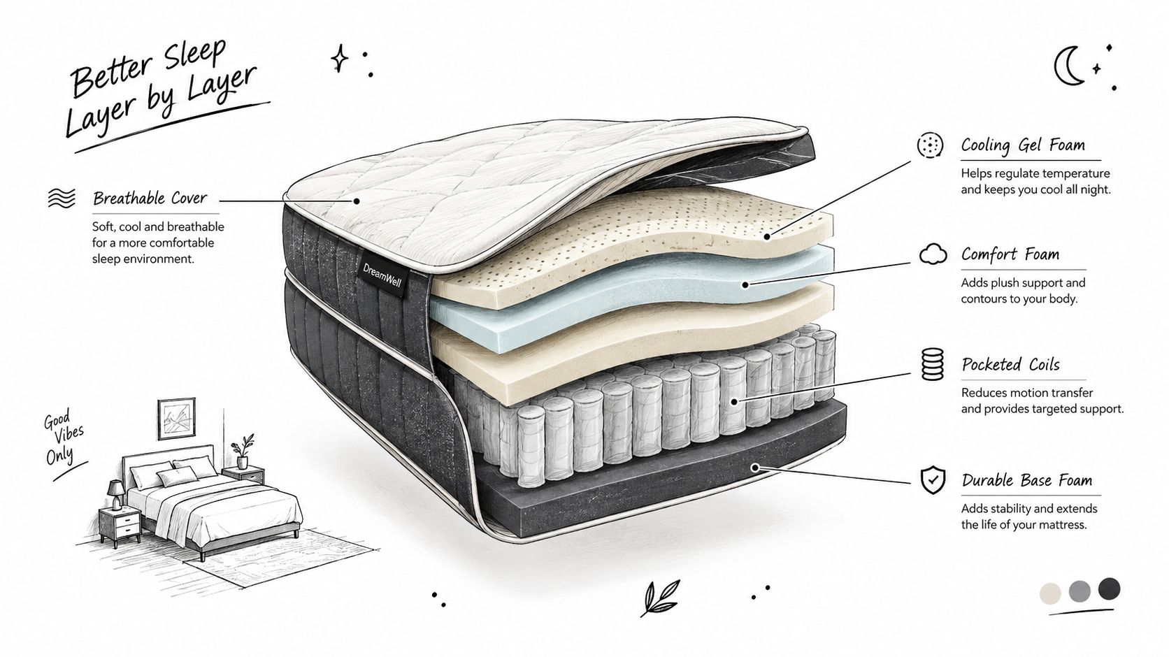
Active comparison: Use a Digibun-style layered image to explain foam layers, coils, quilting, and support construction.
Confidence building: Use room scenes, detail views, and material close-ups to answer questions about quality and scale.
High-intent interaction: Offer zoom, animation, or 3D exploration when the shopper is already investigating a meaningful product difference.
Write alt text for meaning, not decoration
The cover image of a blog can also serve as its hero image, provided the implementation preserves its editorial purpose. A description such as “Exploded view of a mattress showing foam and coil layers” tells an assistive technology user why the image matters. “Hero image” only describes its position on the page.
The same image may need different alt text in different contexts. On a technical article, the layered construction may be the subject. On a brand story page, the image may support a broader message and require a different functional description. If the graphic is purely decorative and repeats information already provided in nearby text, use an empty alt attribute.
Spend rich media where it changes the decision
Heavy 3D visuals can be valuable, especially when the product can't be understood from a conventional photograph. Digibuns, silhouettes, and room scenes let a brand explain construction, scale, and use without arranging a new physical shoot for every variation. They also create a risk when teams place every render, animation, and video on the initial page load.
A better approach is progressive disclosure. Load the essential hero asset first, keep the image container stable, and allow shoppers to open deeper visual explanations when they want them. Lazy-load media below the fold, use responsive formats and dimensions, and reserve video for interactions where motion clarifies a product benefit.
A mattress-specialized partner differs from a general design workflow. Bedhead Marketing combines 3D mattress rendering, product-page development, SEO, paid media, brand development, and sales training around the way mattresses are manufactured, displayed, compared, and sold. The asset isn't finished when it looks attractive. It's finished when the retailer, shopper, or RSA can use it to explain a product difference.
Your Mattress Site Audit and Next Steps
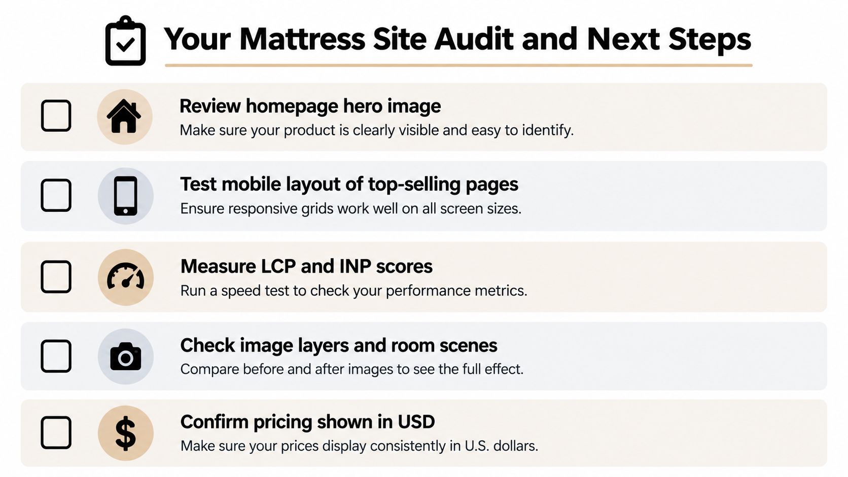
Start with the homepage and the product pages that matter most to the business. Don't begin by redesigning every template. Identify where shoppers lose product context, where the page shifts during loading, and where a phone user can't complete the same task as a desktop visitor.
Run the audit in a practical order
Review the homepage hero image. Confirm that the mattress is visible, the main message is readable, and the primary action isn't buried beneath decorative media.
Test top-selling pages on mobile. Check product grids, firmness selectors, size controls, comparison tables, warranty details, and retailer or checkout paths at narrow widths.
Measure LCP and INP. Use field data where available, then investigate which asset or script controls the first useful view and which interaction feels delayed.
Validate image dimensions. Give every product render, room scene, video, and gallery frame reserved space so late-loading media doesn't move pricing or calls to action.
Check keyboard and screen-reader paths. Move from the main menu through product selection, inquiry forms, and checkout without a mouse.
Review the visual system. Confirm that silhouettes, layer diagrams, room scenes, ticking details, and quilt close-ups each have a defined merchandising purpose.
Compare product claims with visuals. Make sure the diagram, specifications, sales copy, and showroom materials describe the same construction and benefit.
Inspect SEO foundations. Use descriptive headings, useful internal links, crawlable product information, and image alternatives that support the subject rather than repeating filenames.
A useful prioritization rule: Fix the issue that blocks understanding or action before polishing the issue that only affects appearance.
The basics of web design become practical when your team connects layout, accessibility, speed, and imagery to the mattress buying journey. A beautiful page can still fail if the shopper can't compare constructions. A fast page can still fail if the hero image hides the product. A technically compliant page can still fail if its warranty, firmness, or delivery information is difficult to find.
If your internal team can handle the audit, document the findings by template and prioritize development work around revenue-generating pages. If the challenge is inconsistent product imagery, unclear positioning, or a lack of mattress-specific digital execution, specialized support can bring the 3D assets, SEO, paid media, product-page optimization, and sales enablement into one system.
Bedhead Marketing helps mattress manufacturers, retailers, private label brands, and sleep product startups turn complex products into clear digital experiences through mattress-focused web design, 3D renders, product-page optimization, SEO, paid media, and sales training. Review your current visual assets and highest-value product pages, then visit BEDHEAD to discuss a practical path from visual uncertainty to a more usable digital showroom.