Choosing the Right Mattress Website Template
A mattress can be excellent on the showroom floor and still struggle online if shoppers can't understand its construction, compare it with alternatives, or trust the delivery and trial terms. That's why choosing a mattress website template isn't mainly a design decision. It's a merchandising decision that affects how shoppers evaluate ticking, quilt, gusset, foam layers, hybrid construction, firmness, and the risk of buying a high-ticket sleep product without testing it first.
Digital commerce is already a core channel for the category. The global online mattress segment is valued at about US$15 billion, representing roughly 23% to one quarter of the total mattress market, while the U.S. market is projected to reach US$6.9 billion by 2025 and about US$8.4 billion by 2029, according to industry coverage of ecommerce in the mattress industry. A template that only makes a brand look polished is underbuilt for the job. It needs to guide a hesitant buyer from discovery to confident purchase.
Bedhead Marketing works exclusively with mattress manufacturers, brick-and-mortar and ecommerce retailers, private label brands, and sleep product startups. Its work combines mattress-specific strategy, SEO, paid media, sales training, brand development, and 3D assets such as Digibuns layered product views, Silhouettes, and Room Scenes.
Evaluating Mobile-First Template Structures
A responsive template shrinks and rearranges a desktop page. A mobile-first mattress website template starts with the question of how a shopper will make a considered purchase on a small screen, often while comparing several products in quick succession.
The distinction matters. In 2025, mobile devices accounted for 51.4% of online spending, and smartphones drove more than 75% of visits to U.S. retail websites in Q1 2024, according to web design and ecommerce coverage. Those shoppers need more than a page that technically fits their phone. They need a clear path through firmness, materials, height, sleep-position guidance, delivery, trial, and price.
What mobile-first merchandising looks like
A strong template should support:
Fast product comparison: Shoppers should be able to compare firmness, construction, height, cover materials, and intended sleeper profile without opening a maze of tabs.
One-product landing flows: A single hybrid mattress promoted through paid search or Meta should have a focused path from promise to proof to purchase, without forcing visitors through a generic catalog.
Editorial education: Modular sections should explain foam layers, coils, cooling materials, edge support, ticking, and quilt construction in plain language.
Persistent purchase access: The price, size selector, and primary CTA shouldn't disappear below a long product story on mobile.
Readable media: Room Scenes, layer diagrams, and product silhouettes must remain useful when displayed in a narrow viewport.
Marketplace demos often emphasize page count, decorative animation, and broad visual style. Those features can be useful, but they don't prove that the template supports a guided buying journey. Test the actual mobile menu, variant selector, comparison behavior, sticky elements, and content blocks before committing.
Practical rule: If your team can't explain a mattress clearly using the template's mobile components, the theme is decorative rather than commercial.
Review the difference between adaptive and genuinely responsive structures in this guide to responsive design. Then test each candidate with a real product, not placeholder copy. A template that works for a simple accessory may fail when it has to present a thick hybrid, multiple sizes, layered construction, and a trial policy without creating friction.
Designing High-Converting Product Detail Pages
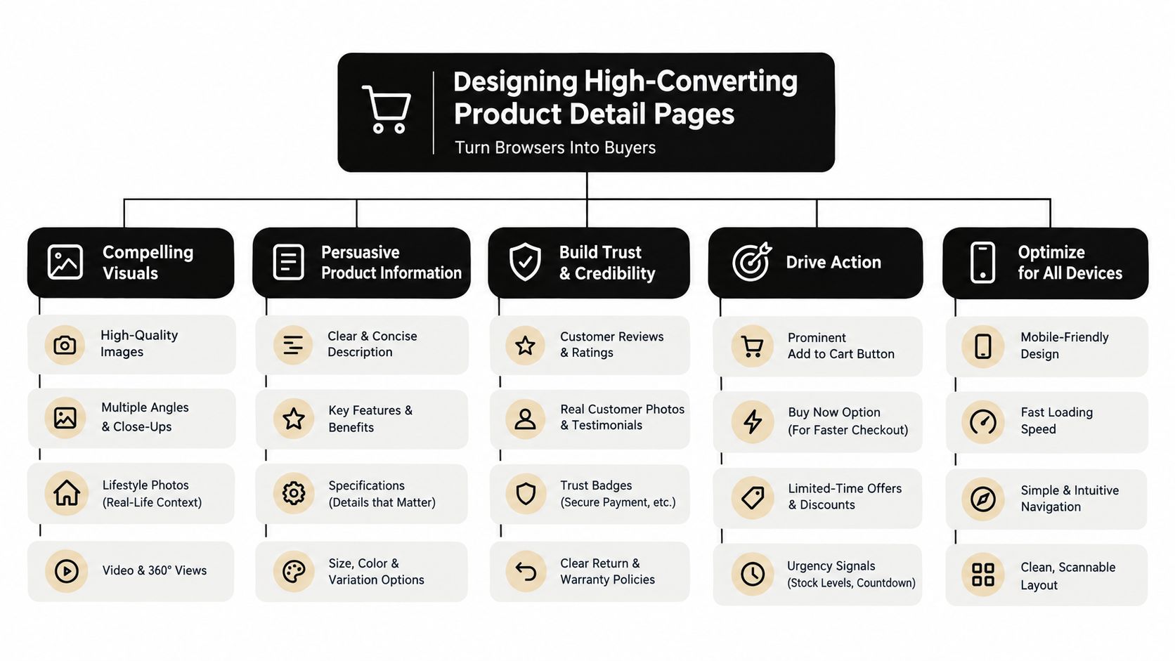
A beautiful homepage won't rescue a confusing product detail page. Mattress shoppers make their decision on the PDP, where they need to connect a headline benefit with physical construction, comfort expectations, price, and reassurance.
Baymard's benchmark of leading U.S. and European ecommerce sites found that only 48% achieve a “decent” or “good” Product Page UX, while the average site still contains 24 structural usability issues, as documented in Baymard's Product Page UX research. That benchmark is a useful warning for mattress brands. A polished theme can still produce a weak buying experience.
Build the page around shopper questions
Start with the first screen. It should establish the mattress name, core positioning, strongest visual, price or starting price, size selection, firmness cue, and purchase CTA. Don't make shoppers scroll past a cinematic video before they can determine whether the mattress fits their needs.
Then organize the rest of the page in a deliberate hierarchy:
Comfort and construction summary: State who the mattress suits, how it feels, and what makes the build different.
Layer visualization: Use a Digibun to show foam layers, coils, support zones, comfort materials, and the relationship between them.
Decision support: Explain firmness, height, sleep position, body support, motion separation, and temperature considerations.
Reviews and proof: Put review visibility close to the buying decision. A star rating without useful written feedback won't answer questions about sagging, edge support, or actual comfort.
Policy reassurance: Surface shipping, trial, returns, and warranty information before checkout anxiety peaks.
Audit the default layout before customization
Open the template's default PDP and ask whether a retailer could sell a floor model through it without a sales associate. If the answer is no, the page needs more than brand colors and new photography. Use the practical framework in this guide to product detail page optimization, especially when mapping content blocks to the questions a showroom associate normally answers.
A good mattress PDP doesn't dump every specification into one long section. It lets shoppers scan first, investigate second, and purchase when ready. The template must give your team control over that sequence.
Integrating 3D Assets and Layered Imagery
Traditional photography shows what a mattress looks like. It often doesn't show why it feels different, how its layers work, or how its scale relates to a bedroom. For online mattress sales, that missing explanation creates uncertainty.
Industry research on product imagery reports that 94.1% of online shoppers carefully evaluate product images, and 83.6% say image quality directly influences buying decisions, according to product imagery research. That makes visual merchandising a commercial requirement, not a finishing touch.
Match each visual to a buyer concern
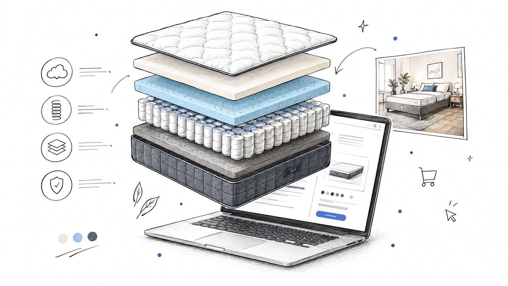
A useful visual system gives every asset a job:
Silhouettes clarify the overall profile, cover design, gusset, quilt, and height.
Digibuns expose the internal build, including comfort foams, transition layers, coil units, and support elements.
Room Scenes show proportion, styling, and how the mattress sits within a real sleep environment.
Interactive models let shoppers inspect construction or rotate a product instead of relying on one fixed angle.
Close-up renders explain ticking texture, quilting, handles, edge treatment, and other details that standard lifestyle photography may obscure.
Shopify-referenced reporting says shoppers were 44% more likely to add an item to cart after interacting with a 3D model, while industry summaries cite conversion lifts of up to 90% or 94% when 3D or AR content is added, as discussed in Shopify's AR shopping overview. Those figures shouldn't be treated as a promise for every mattress store. They do support testing interactive visualization where construction or scale is difficult to communicate.
Photorealistic 3D rendering also gives manufacturers and private label brands consistency across launches. A single approved model can produce a clean product view, a layer breakdown, a room scene, paid-ad crops, retailer assets, and sales training materials without repeatedly arranging a physical shoot. Teams exploring scalable product photo generation can use it as part of a broader asset workflow, provided the final images accurately represent the mattress being sold.
The template must accommodate these assets without forcing awkward galleries or slow, intrusive embeds. Check whether media blocks support responsive cropping, captions, thumbnails, zoom, lazy loading, and accessible text. For a deeper look at how visualization supports mattress merchandising, review 3D product visualization.
Surfacing Trust Signals and Trial Policies
A mattress buyer can't lie on the product through a screen. They can't judge the feel of the quilt, the resilience of the comfort foams, or whether the edge support matches expectations. The website has to compensate by reducing uncertainty with clear information at the moments when the shopper is most likely to hesitate.
Independent consumer research links mattress buying satisfaction closely to purchasing from reliable retailers, making trust design a conversion prerequisite rather than a cosmetic choice, as shown in consumer research on mattress retailers.
Put reassurance beside the decision
Don't hide the trial period and returns policy in the footer. Place a short summary near the price and CTA, then provide a fuller explanation lower on the page. A shopper deciding between two firmness options should be able to understand whether the purchase is reversible before selecting a size.
Use modular blocks for:
Delivery expectations: Explain where the mattress ships from, how delivery works, and what the customer should prepare for.
Trial terms: State when the trial begins, what conditions apply, and what happens if the comfort isn't right.
Returns: Explain pickup, packaging, fees if applicable, and the process for starting a return.
Warranty: Summarize coverage, exclusions, and how a claim works.
Support access: Give shoppers a visible route to a human or well-designed support tool when the product page can't answer a question.
The language needs to match the operating reality. Don't promise white-glove delivery if the retailer uses threshold delivery. Don't describe a trial as risk-free if return conditions apply. Clear limitations build more confidence than vague reassurance because they help shoppers form accurate expectations.
A template should also allow trust information to appear in checkout, cart drawers, comparison tools, and post-purchase pages. Reliability isn't a single badge. It's a consistent experience from product discovery through delivery and support.
Optimizing Visual Performance and Core Web Vitals
Rich mattress imagery creates a practical tension. Shoppers need enough visual information to understand a hybrid build, room scale, ticking, quilt, and profile. But oversized lifestyle files, unoptimized 3D embeds, and unnecessary scripts can slow the page before the shopper reaches the CTA.
Google and Deloitte's mobile speed research found that a 0.1-second improvement in mobile site speed increased retail conversion rates by 8.4% and average order value by 9.2%, according to the Milliseconds Make Millions report. The result makes speed worth treating as a merchandising safeguard, not just a developer concern.
Use a controlled asset workflow
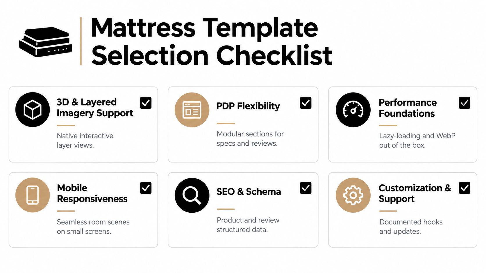
Start by deciding which visual appears first on each template type. A hero image should communicate the product quickly, while secondary Room Scenes and layer views can load as the shopper moves down the page. Lazy loading matters here. Don't force every image, video, and interactive model to load before the first meaningful content appears.
A practical workflow includes:
Compressing source files: Export product visuals at the largest useful display size, then create responsive variants for smaller screens.
Using modern formats: WebP can reduce image weight when the platform and browser support it without compromising important construction details.
Lazy-loading below-the-fold media: Delay lifestyle imagery, expanded galleries, and interactive elements until the page needs them.
Reviewing scripts: Remove apps and tracking tools that duplicate functionality or block rendering.
Testing real PDPs: Use a heavy hybrid product with multiple gallery assets, not a lightweight sample product.
Monitoring Core Web Vitals: Check loading, interaction responsiveness, and visual stability on mobile after every major template or app change.
Keep rich media useful, not excessive
More imagery isn't automatically better. A dozen similar angles can distract shoppers, while a small set of purposeful views can answer construction, comfort, scale, and styling questions efficiently.
For teams working on a Shopify store, this Shopify Plus performance checklist offers a useful technical reference. Bedhead can also support mattress brands with image optimization and product-page implementation, including the workflow described in how to optimize images for the web. The best template preserves visual depth while keeping the first interaction fast and stable.
Finalizing Your Template Selection Checklist
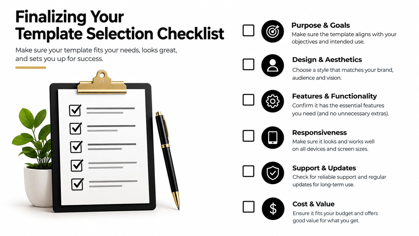
Before buying a theme or commissioning custom development, test the template against actual business needs. A mattress manufacturer may need a product education microsite and retailer-ready assets. A DTC startup may need a one-product funnel. A showroom retailer may need location pages, financing information, and a store-to-site journey. The correct choice depends on the sales model, not the demo's visual polish.
Score the structure before the style
Use a simple review process with your marketing, ecommerce, sales, and operations teams. Ask each person to assess the candidate against the same criteria:
Evaluation area | What to inspect |
|---|---|
Product education | Can the page explain foam layers, hybrid construction, firmness, ticking, quilt, gusset, and care without custom workarounds? |
Merchandising | Can shoppers compare models, sizes, heights, and comfort profiles quickly? |
Trust | Are delivery, trial, returns, warranty, and support blocks visible near the decision? |
Mobile behavior | Does the gallery, selector, sticky CTA, and comparison experience work on a small screen? |
Performance | Can the team lazy-load rich media and control scripts, apps, and embeds? |
SEO foundations | Does the CMS support useful category pages, educational content, product metadata, reviews, and structured data? |
Operations | Can staff update prices, inventory messages, policies, imagery, and product copy without developer dependency? |
Accessibility | Are contrast, keyboard navigation, labels, focus states, and alternative text handled properly? |
Test the buying journey, not just the homepage
Run a realistic scenario. A shopper lands on a paid ad for a cooling hybrid, compares it with a foam model, checks the layer construction, reads reviews, confirms delivery and trial terms, selects a size, and reaches checkout. Record every point where the template makes that path harder than it would be with a knowledgeable retail sales associate.
Support tools can help with questions, but they shouldn't cover structural weaknesses. If you're evaluating conversational support, review ready-made chatbot examples for ideas, then decide whether a chatbot can answer mattress-specific questions accurately or whether the page needs better education first.
The template should also support your broader commercial system. SEO for mattress brands, Google and Meta campaigns, email flows, showroom training, presentation decks, and retailer activation all depend on consistent product language and approved visuals. Bedhead's mattress-focused work spans those areas, including 3D rendering, product-page development, performance marketing, brand positioning, and sales training.
Choose the template that makes the guided buying journey easier to execute and maintain. Aesthetic appeal matters, but it should follow clarity, trust, visualization, and performance.
If you're evaluating a mattress website template, BEDHEAD can help audit the structure, develop accurate 3D assets, and shape product pages around the questions mattress shoppers ask. Bedhead also offers mattress-specific SEO, paid media, brand development, and sales training for manufacturers, retailers, private label brands, and sleep startups. For ongoing industry insights, news, training, networking, directory access, and business tools, join the free Bedhead Network for mattress professionals.