How to Create Landing Pages That Convert Mattress Shoppers
A mattress brand can spend heavily on Google Ads, Meta, or email and still watch shoppers disappear after the click. The product may be excellent, the showroom team may sell it well, and the margins may be healthy, yet a generic homepage rarely explains why one hybrid mattress deserves consideration over the next. Learning how to create landing pages for mattress shoppers means treating the page as part of the selling experience, not as a digital brochure.
A strong mattress landing page gives one audience one reason to act. It clarifies the sleep benefit, shows what sits beneath the ticking, answers purchase concerns, and makes the next step obvious. The benchmarks provide useful context, but they don't define a universal winning design. Across industries, the median landing page conversion rate is 6.6%, average benchmark sets often sit around 4% to 5%, and top-performing pages can exceed 11%, according to Involve.me's landing page statistics. Mattress brands should use those figures as a starting point, then judge performance against audience, offer, product price, traffic source, and buying journey.
Why Most Mattress Landing Pages Fail to Convert
A bedding company launches a campaign for a new hybrid mattress. The ad promises pressure relief, temperature management, and responsive support. The click lands on the corporate homepage, where the visitor sees navigation for every collection, a retailer locator, an accessories menu, a long brand story, and several competing promotions. The shopper still doesn't know which model matches the ad or what to do next.
That page may be attractive, but it makes the visitor reconstruct the sales pitch. A dedicated landing page removes that work. It carries the campaign promise forward, presents one relevant product story, and moves the shopper toward one action, such as booking a showroom appointment, viewing the mattress, requesting a private-label conversation, or starting checkout.
The homepage problem
Homepages serve multiple audiences. A manufacturer may need to speak to retailers, component suppliers, consumers, and potential employees. A DTC mattress landing page has a narrower job. It should support the exact visitor who arrived from a specific message.
Message match matters because mattress shoppers arrive with different concerns:
A paid search visitor may be comparing cooling hybrids and expects clear construction details.
An email visitor may already know the brand and need a timely offer or product reminder.
A social visitor may need more visual proof before considering a purchase.
A retail appointment visitor may want confidence that the floor model is worth seeing in person.
A page that tries to satisfy all four often satisfies none of them.
Mattress-specific friction
Poor visualization creates uncertainty. A front-facing product photo can show the ticking, quilt, and gusset, but it rarely explains the foam layers, coils, edge support, or comfort architecture inside the mattress. If the copy says “advanced layered comfort” without showing the construction, the shopper has to take the claim on faith.
The showroom creates a second challenge. Retail sales associates can compress a complex product story into a conversation, while a DTC page must make the same story understandable without a salesperson. Floor models, brand cards, and verbal selling frameworks don't automatically transfer to mobile screens.
Practical rule: If the visitor can't identify the product, the benefit, and the next action quickly, the page is asking the shopper to do too much selling work.
Use a structured usability review to find those problems before spending more on traffic. Bedhead's guide to conducting usability testing is useful for checking whether real shoppers understand the offer, interpret the visuals correctly, and find the CTA without assistance. For broader location-based campaign planning, the resource by Digital Skyrocket offers helpful context on creating focused pages for specific audiences and locations.
A high-converting mattress page doesn't need to imitate a SaaS signup page. It needs to make comfort, construction, trust, and the buying path visible. That distinction shapes every decision that follows.
Define Your Goal and Match the Message to the Traffic Source
Start with the commercial outcome, not the template. A mattress manufacturer may want qualified retailer inquiries. A brick-and-mortar operator may want showroom appointments. A DTC team may want product purchases, while a sleep startup may be collecting interest before a launch.
Write the desired action in one sentence:
“After visiting this page, the shopper should…”
If the answer contains several actions, separate the campaigns. A page designed to collect a retailer inquiry shouldn't compete with a consumer discount. A page built for checkout shouldn't lead with a wholesale capabilities deck.
Choose the offer before the layout
The offer must fit the audience's readiness.
Audience | Useful page goal | Appropriate CTA | Proof to emphasize |
|---|---|---|---|
Mattress retailer shopper | Book a test or showroom visit | Find a nearby retailer | Comfort guidance, availability, store confidence |
DTC shopper | Purchase or begin product selection | Choose your comfort or Shop the mattress | Construction, delivery, returns, reviews |
Private-label buyer | Start a product conversation | Discuss your private-label program | Manufacturing capability, customization, presentation assets |
Sleep product startup prospect | Join an early interest list | Join the waitlist | Product concept, differentiation, launch updates |
The page should preserve the language that brought the visitor there. A paid search ad for “cooling hybrid mattress” should lead with cooling construction, a visible hybrid breakdown, and proof that supports that claim. A retail ad should not force the visitor through DTC checkout language when the actual conversion is an appointment.
Channel benchmarks reinforce this alignment principle. Email traffic converts at about 19.3%, paid social around 12%, paid search around 10.9%, and display ads near 4.1%, according to Shopify's landing page statistics. Those figures aren't promises for a particular mattress campaign, but they show why the same page shouldn't be judged or structured identically across channels.
Adjust depth for intent
Email visitors often recognize the brand, so the page can move faster toward the offer. Paid search visitors may need a direct comparison between foam and hybrid construction. Social visitors often benefit from strong visuals, plain-language benefits, and trust signals. AI referral visitors create another consideration. A 2026 benchmark summary reported AI referral traffic converting at 5.8%, ahead of paid search at 5.4%, which makes source-specific attribution and message matching increasingly important, as described by CartFlows' landing page statistics.
AI-referred shoppers may arrive after seeing a summarized recommendation. They can have clear intent but less context about your brand. Give them concise product facts, transparent construction, a clear offer, and an easy path to verify details.
Keep source data connected to the funnel. Track which campaign, audience, device, and offer produced the lead or order, rather than stopping at clicks. For consumer research and preference capture, zero-party data can help you ask shoppers directly about firmness, sleeping position, cooling needs, or store preferences.
Build the Wireframe and Visuals That Sell the Sleep Experience
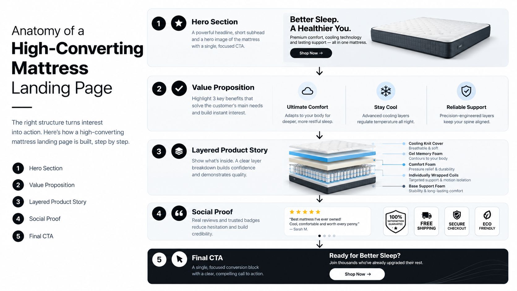
A mattress landing page should guide the shopper through the same sequence as a strong showroom conversation: identify the bed, understand how it may feel, see what supports that experience, then find enough reassurance to act. Build the wireframe around that decision path rather than around a catalogue of features.
Use a focused vertical structure:
Hero section: Show the mattress clearly, state the primary benefit, and place one CTA beside the opening message.
Value proposition: Connect ticking, foam layers, coils, cooling, motion, support, or durability to a practical sleep benefit.
Layered product story: Use a Digibun or construction visual to reveal what sits beneath the ticking.
Trust section: Present reviews, retailer credibility, warranties, certifications, or clear policy details.
Final conversion block: Repeat the same action without sending shoppers toward a competing destination.
Give each visual a job
A clean silhouette gives shoppers immediate product recognition. It can show profile, height, border treatment, quilt pattern, and gusset detail without the distraction of a bedroom scene. Place it beside technical specifications or comparison selectors when shoppers need to distinguish one model from another.
A Digibun, a layered visual that exposes the inside of the product, answers a different question. It can show comfort foam, transition foam, coils, edge support, and foundation components, helping shoppers connect construction with expected feel. For a hybrid mattress, that explanation may sell more effectively than another close-up of the quilt.
A room scene helps visitors picture the mattress in a real bedroom. It provides scale, color, lifestyle context, and continuity between showroom presentation and delivery to the home. Use practical guidance on how to use imagery to assign the scene a clear role. Keep the product view available because a lifestyle image rarely explains construction by itself.
Protect the visual hierarchy
The hero should support the headline rather than compete with it. HubSpot recommends a baseline hero size of 1920 × 1080 px, with 2560 × 1440 px or higher for retina displays, and suggests keeping hero images under 500 KB whenever possible, as explained in its hero image guidance. Treat those dimensions as production references, then export responsive versions for the actual display size.
On mobile, a tall bedroom scene can push the headline and CTA below the first view. Crop with intent, keep the mattress identifiable, and position construction details where smaller screens will not remove them.
The page should contain fewer competing visual messages than a showroom wall. Let the hero establish the promise, let the Digibun explain the build, and let the silhouette clarify the object. Each asset should answer a specific concern instead of decorating the page.
Bedhead's 3D design work includes Digibuns, silhouettes, and room scenes. Using those assets across landing pages, product detail pages, retailer presentations, and sales materials keeps the product story consistent when a shopper moves from online research to a floor model.
Write Copy and Design Forms That Earn the Click
Mattress copy fails when it stops at components. “Premium quilt, cooling cover, and multi-layer foam” describes the build, but it doesn't tell the shopper how the bed may feel or why the construction matters.
Translate each feature into a shopper-facing outcome, while avoiding unsupported promises. A breathable cover may support a cooler sleep experience. A responsive coil unit may help the mattress feel easier to move on. A reinforced edge may make the usable sleep surface feel more stable. The copy should explain the connection without claiming a result you can't substantiate.
Put objections into the page
Shoppers commonly hesitate over firmness, body comfort, delivery, returns, warranty terms, and whether the mattress will feel like the one they tested. Address those questions close to the relevant CTA.
A useful copy pattern is:
Feature: What is physically in the mattress?
Meaning: What does that feature contribute to the sleep experience?
Reassurance: What information reduces the risk of choosing?
For example, “A quilted ticking over responsive comfort foam creates a softer first impression, while the support layers help maintain the mattress's structure.” That sentence gives the shopper a reason to keep reading without promising a guaranteed outcome.
Match the form to the commitment
A showroom appointment form can ask for location, preferred contact method, and the information the sales team needs to prepare. A DTC page should avoid turning purchase intent into an interrogation. A private-label inquiry may need more detail, but the first form still shouldn't feel like a procurement application.
Button text should describe the next step:
“Book a mattress consultation”
“Find this mattress nearby”
“See the hybrid layers”
“Start your private-label conversation”
“Choose your comfort”
Place trust signals beside the form or CTA. Clarify what happens after submission, explain whether a retailer or brand representative will respond, and link to relevant delivery or return information when the funnel requires it.
Copy test: Read the headline without the product image. If the shopper can't tell who the mattress is for and what to do next, the visual is carrying too much of the message.
Don't hide the CTA behind clever wording. Mattress shoppers already face uncertainty. Clear copy, relevant proof, and a low-friction form reduce the mental effort between interest and action.
Launch Fast and Keep It Fast With Smart Technical Setup
The best landing page builder is the one your team can update without breaking tracking, mobile layouts, or brand standards. A CMS may suit a mattress company that needs shared content, SEO controls, and integration with an existing product catalog. A dedicated landing page tool may suit a paid media team that needs rapid campaign variations and fewer development dependencies.
Choose based on operating reality:
Use the existing CMS when product data, analytics, forms, and brand components already live there.
Use a landing page builder when marketing needs to launch campaign pages without waiting for a full site release.
Use a custom build when interactive layer visuals, complex personalization, or retailer-specific experiences justify development support.
Whatever the platform, define tracking before launch. Record the source, campaign, creative, device, CTA click, form completion, appointment outcome, and purchase or qualified inquiry where possible. A page can produce many form fills and still underperform if the sales team receives poor-fit leads.
The conversion tracking setup guide can help teams think through the events and handoffs that connect marketing activity to commercial outcomes.
Set a performance budget
Audit Core Web Vitals separately for mobile and desktop. Common technical thresholds include LCP under 2.5 seconds, TTFB under 600 milliseconds, and CLS below 0.1, as outlined in Digital Applied's landing page performance data. The same benchmark dataset reported that pages loading in under 1.5 seconds converted 2.4 times better than pages loading in 4 seconds, and that each additional second beyond 2.5 seconds reduced conversions by 7%.
Those figures make the largest visual element an obvious place to start. Compress the hero, serve WebP or AVIF files sized to their display dimensions, inline critical CSS for above-the-fold content, and defer non-critical CSS and JavaScript. Don't load a large interactive Digibun before the headline and CTA are usable.
Test where shoppers actually browse
A retail shopper may open the page on a showroom phone while standing beside a floor model. A DTC buyer may return later from a different device at home. Check layouts, image crops, tap targets, form behavior, and sticky elements across both situations.
Monitor speed by device and geography, then compare those results with qualified leads, appointments, and revenue. A performance score matters, but the business needs to know whether the fix improves the buying path.
Test Learn and Optimize After Launch for Higher ROI
Publishing the page is the start of the learning cycle. Mattress shoppers don't respond to every construction story in the same way, and a page that performs well for branded email traffic may struggle with cold paid social visitors. Read results by source, device, audience, and offer before making a major redesign.
Start with the largest uncertainty. If visitors don't understand the product, test the headline and hero treatment. If they understand the mattress but hesitate, test proof, policy language, or offer framing. If they engage with the page but don't submit, inspect the form and CTA path.
Prioritize tests that answer real questions
A practical testing sequence might include:
Hero and headline: Does a room scene create more interest than a silhouette for this audience?
Construction visual: Does the Digibun explain the hybrid build better than a static product image?
Offer framing: Does the page need a consultation, a product selector, a retailer locator, or a direct purchase prompt?
Form design: Are shoppers abandoning because the form asks for information the sales team doesn't need yet?
CTA placement: Does the action remain easy to find after the visitor reads reviews, specifications, and policy details?
Change one meaningful variable at a time when the traffic volume allows a clean comparison. Otherwise, you won't know whether the new hero, revised copy, and shorter form helped individually or changed the page as a whole.
Decide whether to iterate or rebuild
A page with strong engagement but weak form completion may need a clearer offer or lower-friction form. A page with weak engagement may have a message-match problem, a slow hero, or an ad that promises something the page doesn't deliver. A page that attracts the wrong audience shouldn't be “optimized” into success through button color changes.
Feed useful findings back into paid media and product page optimization. If shoppers repeatedly engage with the Digibun, use that construction language in search ads, retailer education, sales decks, and PDP sections. If a room scene works for lifestyle traffic but not technical search traffic, keep the asset but assign it to the right campaign.
Industry performance varies widely. Benchmark summaries place median conversion rates around 3.8% for SaaS and 12.3% for events and entertainment, showing why mattress teams should treat benchmarks as context rather than a universal target, as reported by SERP Sculpt's conversion rate summary. A mattress page must account for product consideration, visualization, returns, margins, showroom support, and the difference between browsing and buying.
Bedhead University offers education for teams that want to strengthen their mattress marketing knowledge, from brand presentation to digital execution. Mattress professionals can also use the free Bedhead Network for industry insights, news updates, networking, training resources, a directory, and business tools.
Evaluate your current campaign pages by asking whether the visual story explains the ticking, quilt, gusset, and foam layers clearly enough for a shopper to act. Then test the highest-friction point first, rather than rebuilding the entire site because one landing page underperforms.
Bedhead provides mattress-specific landing page strategy, SEO, paid media support, product page optimization, sales training, and 3D assets including Digibuns, silhouettes, and room scenes. If your campaign traffic isn't translating the showroom story into a confident online decision, visit BEDHEAD to discuss a focused landing page and visual system for your brand.